2016年色彩検定協会主催セミナー
大阪(色彩検定協会 新大阪研修室)・2016年2月20日(土) 14:00-16:30
東京(TKP東京日本橋カンファレンスセンター)・2016年2月21日(日) 14:00-16:30
ふしぎな錯視 ―錯視をデザインに活かす―
立命館大学文学部人文学科心理学専攻(心理学域) 北岡 明佳 email HP
(立命館大学 文学部 心理学専攻)
2016/2/15より ハンドアウト・ハンドアウト2・ハンドアウト3
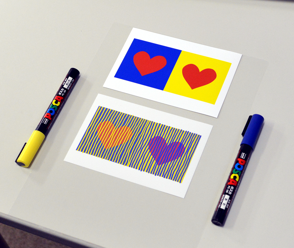
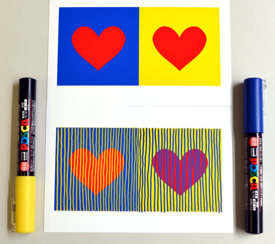
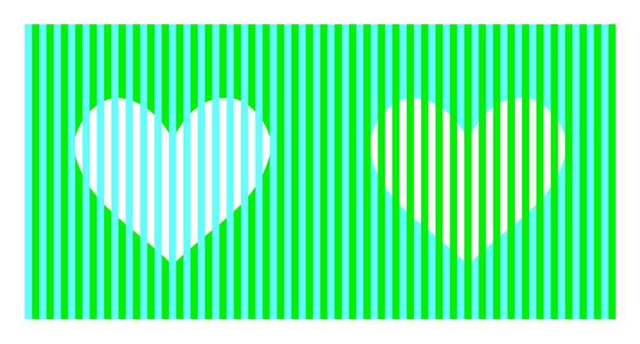
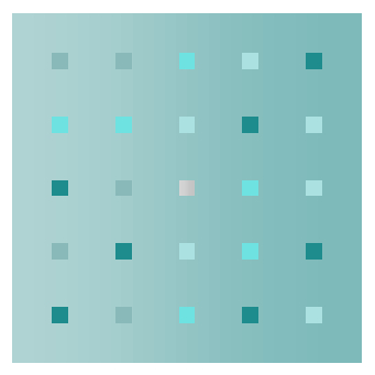
<色の錯視クイズ>
左のハートと物理的に同じ色は(1)(2)(3)のうちどれでしょう。
問1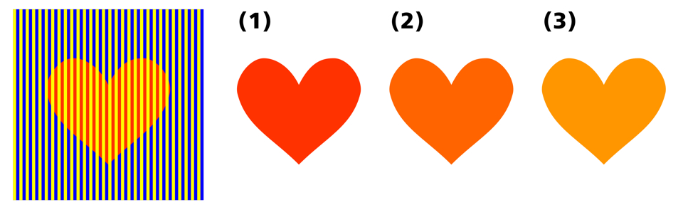
問2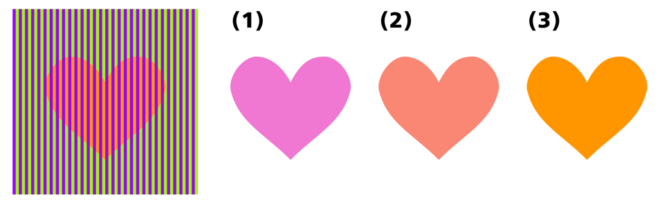
問3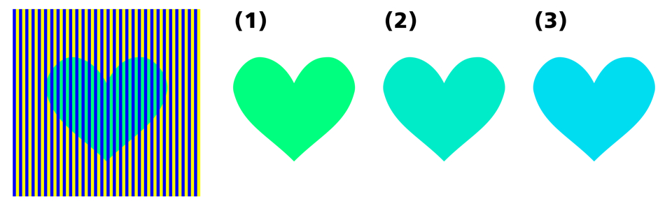
問4 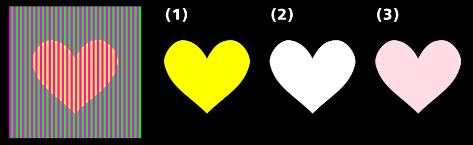
問5 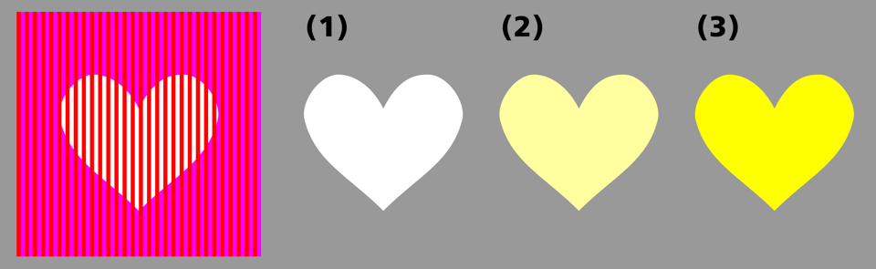
問6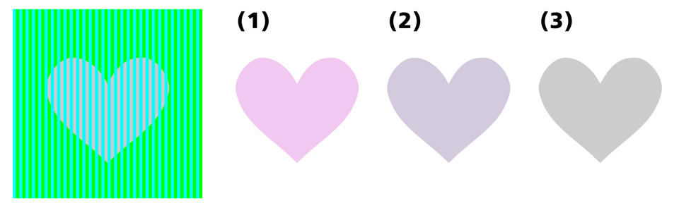
問7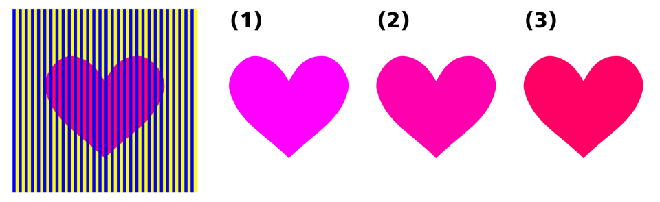
問8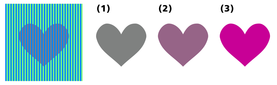
問9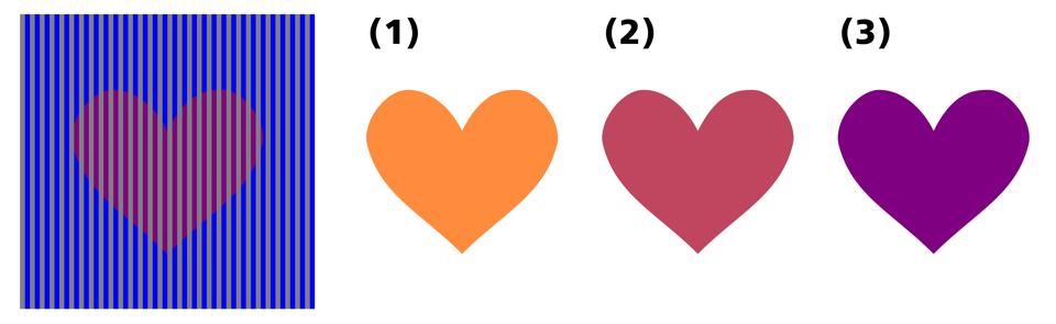
問10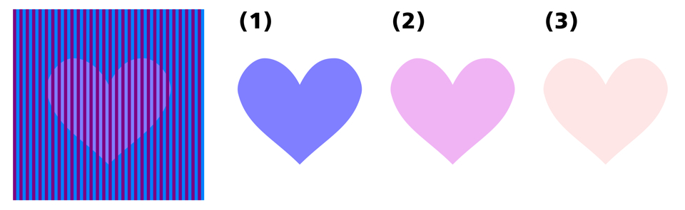
2012/8/17
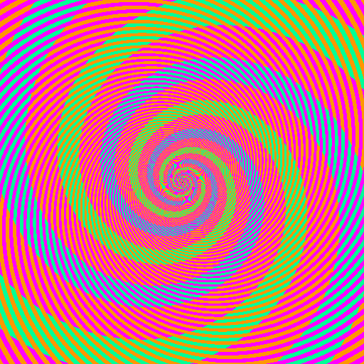
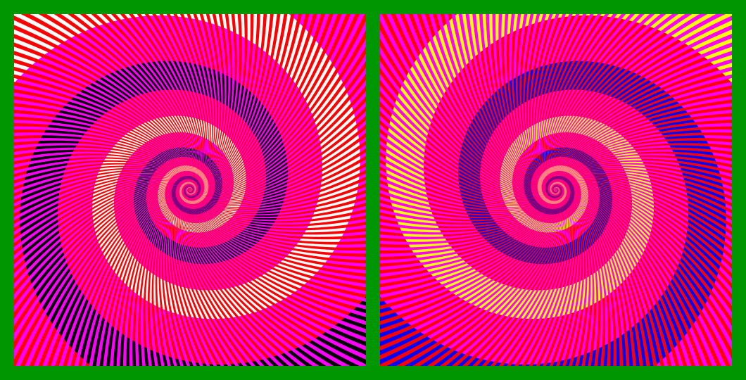
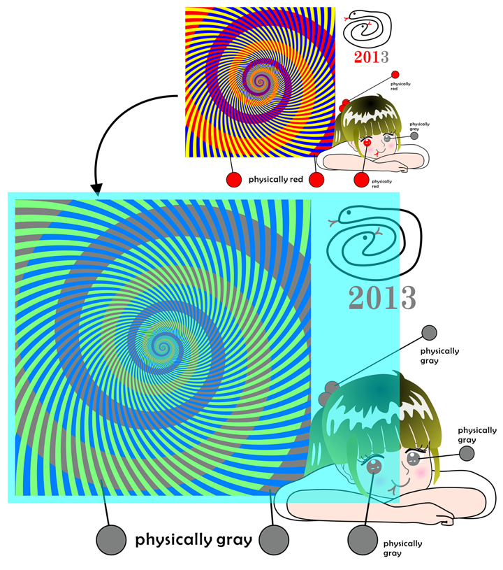
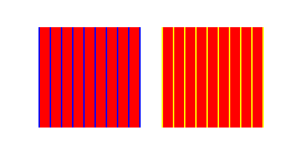
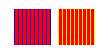
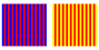
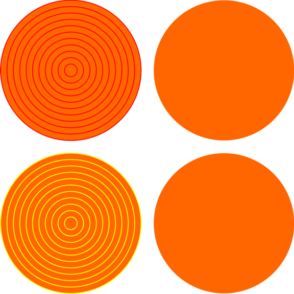
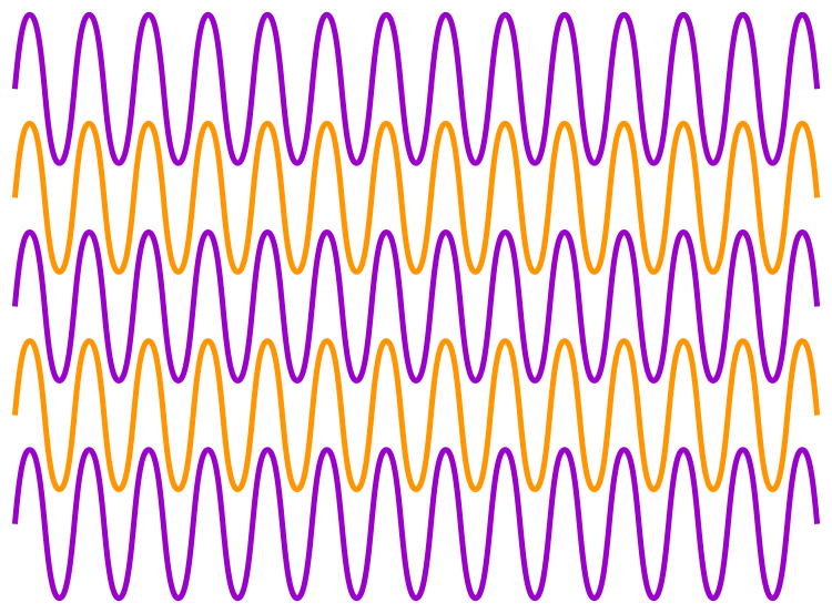
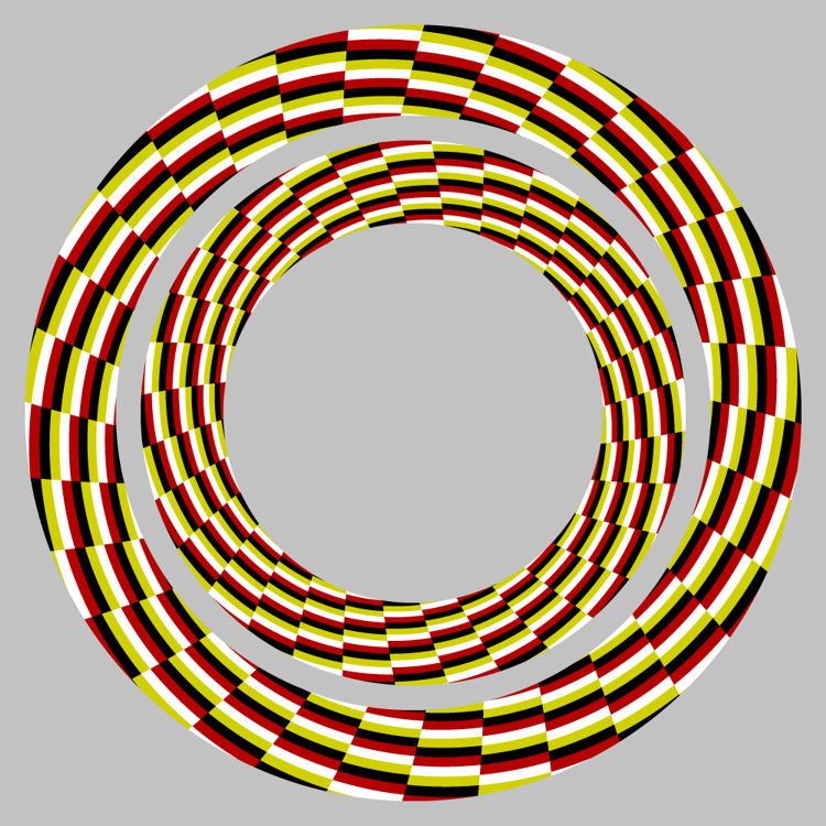
ムンカー錯視を用いた作品「赤の渦巻き」↓
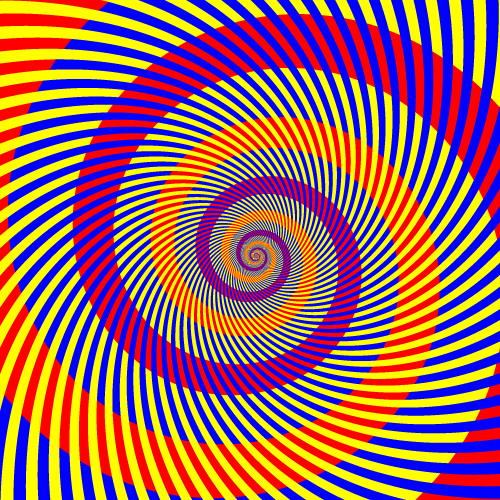
赤紫がかった赤い螺旋とオレンジ色がっかった赤い螺旋があるように見えるが、どちらも同じ赤である。
Copyright A.Kitaoka 2002
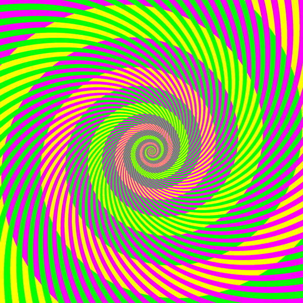
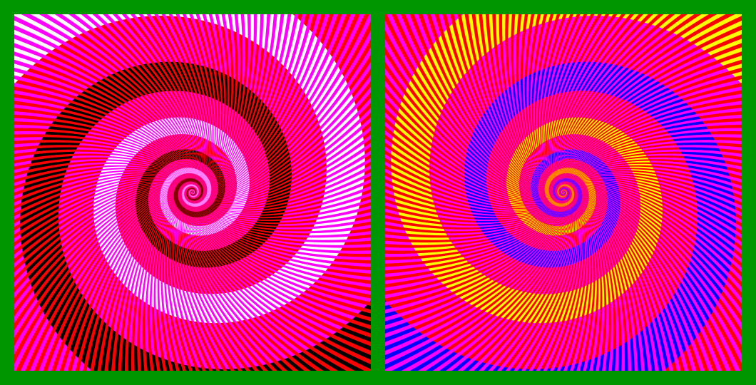
ムンカー錯視を用いた作品「緑の渦巻き」↓
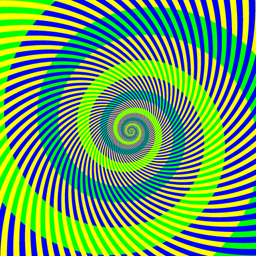
黄緑の螺旋と青緑の螺旋があるように見えるが、どちらも同じ緑である。
Copyright A.Kitaoka 2002
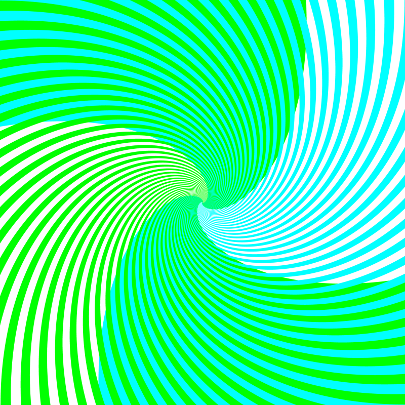
ムンカー錯視を用いた作品「水色と黄緑の渦巻き」↓
水色の螺旋と黄緑の螺旋があるように見えるが、どちらも同じ色(r = 0, g = 255, b = 150)である。この色の錯視はモニエ・シェベル錯視に近いと思うが、彼らの理論には合わないのかもしれない。
Copyright A.Kitaoka 2003
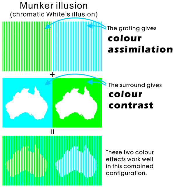
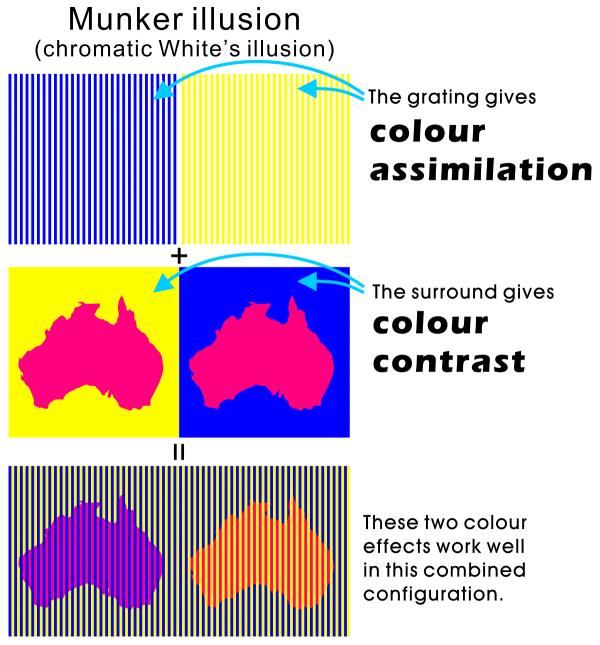
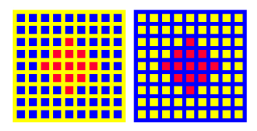
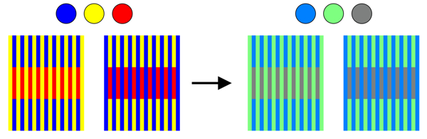
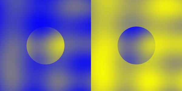
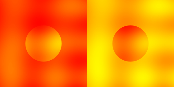
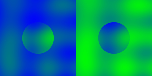
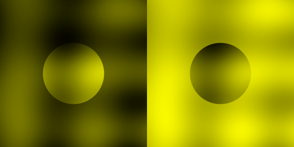
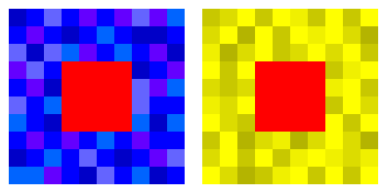
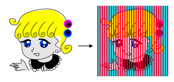
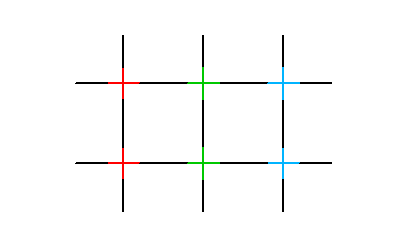
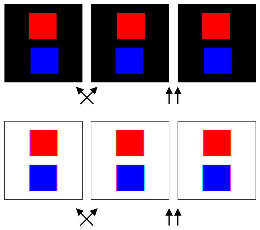
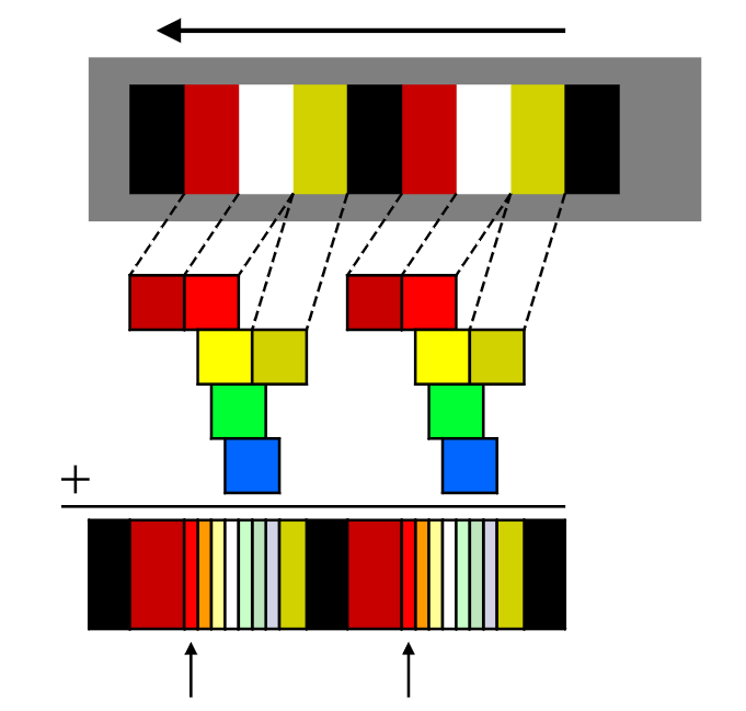
ムンカー錯視(Munker illusion)

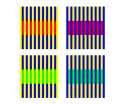
黄と青の縞の青部分に赤を乗せるとオレンジ色に見え、黄部分に赤を乗せると赤紫がかって見える。緑を乗せるとそれぞれ黄緑と青緑に見える。高空間周波数図形で錯視量が多い。
Munker, H. (1970) Farbige Gitter, Abbildung auf der Netzhaut und übertragungstheoretische Beschreibung der Farbwahrnehmung. München: Habilitationsschrift.
ムンカー錯視の作り方
「レモン色の渦巻きとクリーム色の渦巻き」
渦巻きにはレモン色のとクリーム色のと2種類あるように見えるが、どちらも同じ黄色(R255, G255, B0)である。
Copyright A.Kitaoka 2005 (May 22)
「武田信玄」
薄い黄色と濃い青色の渦巻きがあるように見えるが、左半分は白(R=255, G=255, B=255)と黒(R=0, G=0, B=0)であるのに対し、右半分は黄(R=255, G=255, B=0)と青(R=0, G=0, B=255)である。
Copyright Akiyoshi .Kitaoka 2007 (March 12)
「風林火山」
「武田信玄」の白黒黄青と同じであるが、この図では違いがはっきりわかる。
Copyright Akiyoshi .Kitaoka 2007 (March 12)
「小家族」
左の鳩も右の鳩も同じ色なのだが、左の方は黄味がかって見える。
Copyright Akiyoshi .Kitaoka 2007 (March 12)
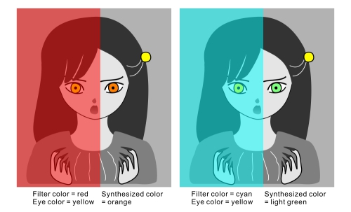
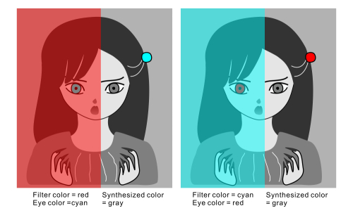
Left: Green (assimilation) + Red (contrast of cyan) = Yellow induction; Right: Cyan (assimilation) + Magenta (contrast of Green) = Blue induction
 OK?
OK?
Left: Blue (assimilation) + Blue (contrast of yellow) = Blue induction; Right: Yellow (assimilation) + Yellow (contrast of blue) = Yellow induction
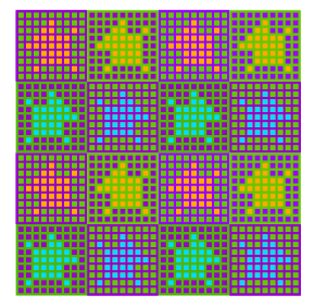
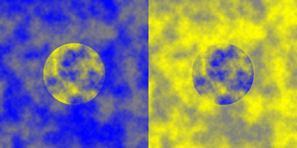
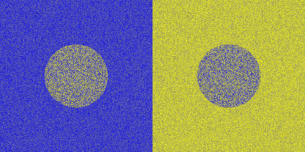
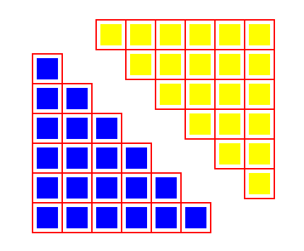
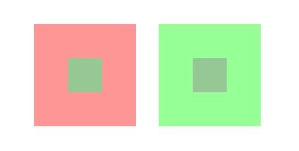
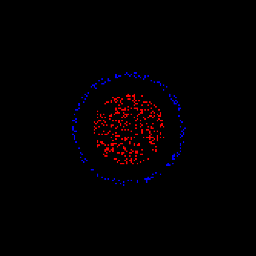
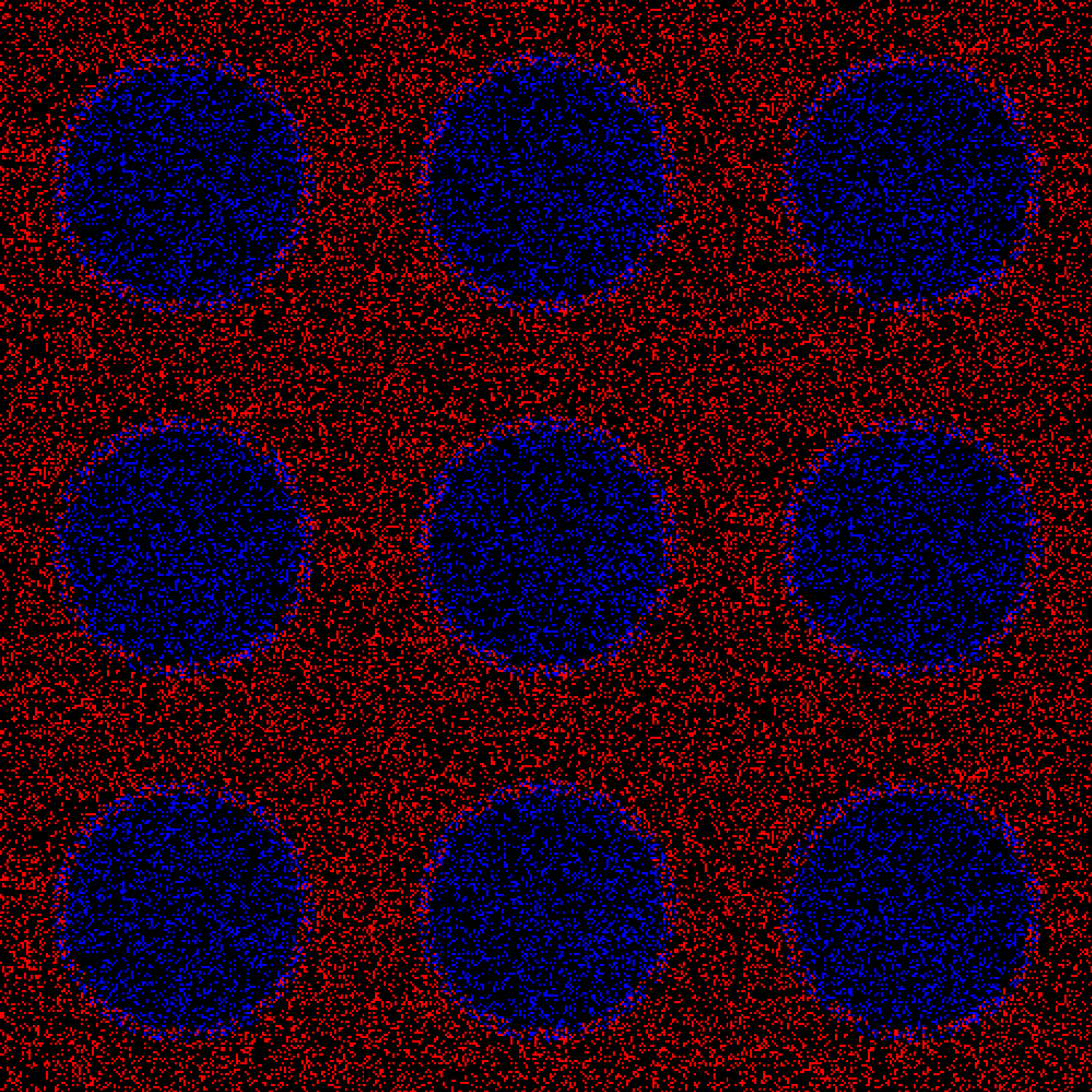
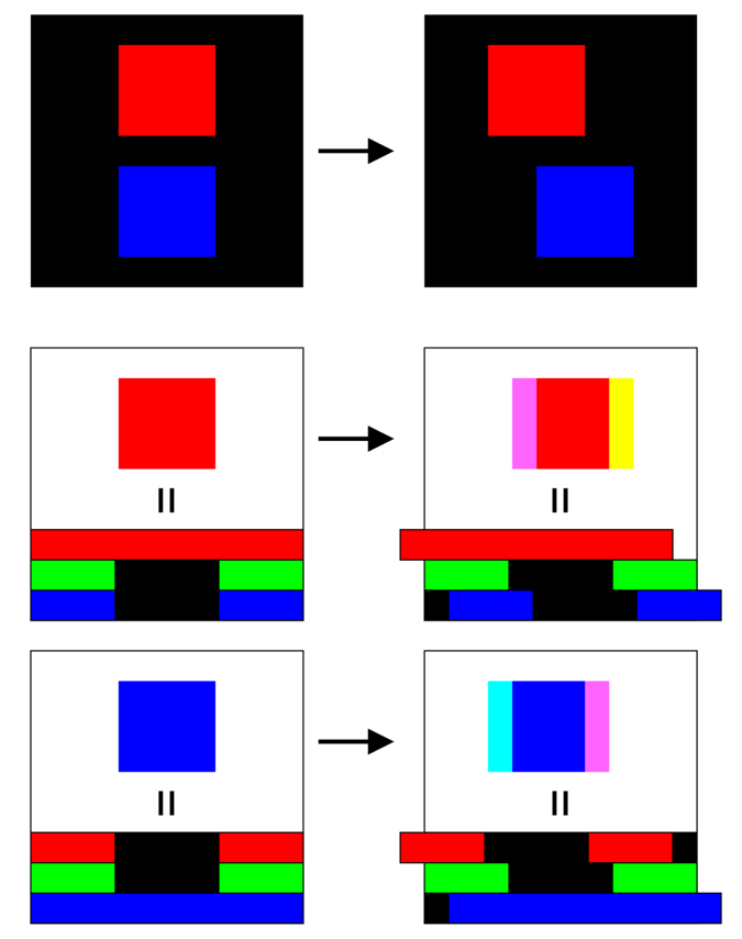
色の土牢錯視 (Chromatic dungeon illusion)
「犬」
赤い犬は2種類、緑の犬も2種類いるように見えるが、それぞれ同じ赤と緑である。色の土牢錯視である。
別バージョン 別バージョン2
Copyright Akiyoshi .Kitaoka 2007 (January 5)
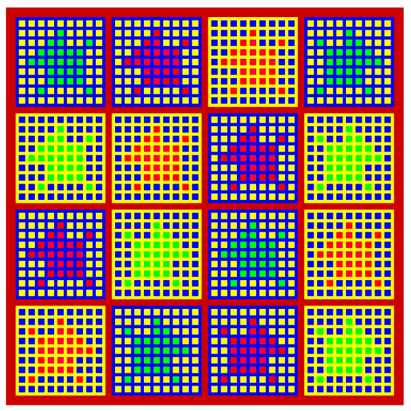
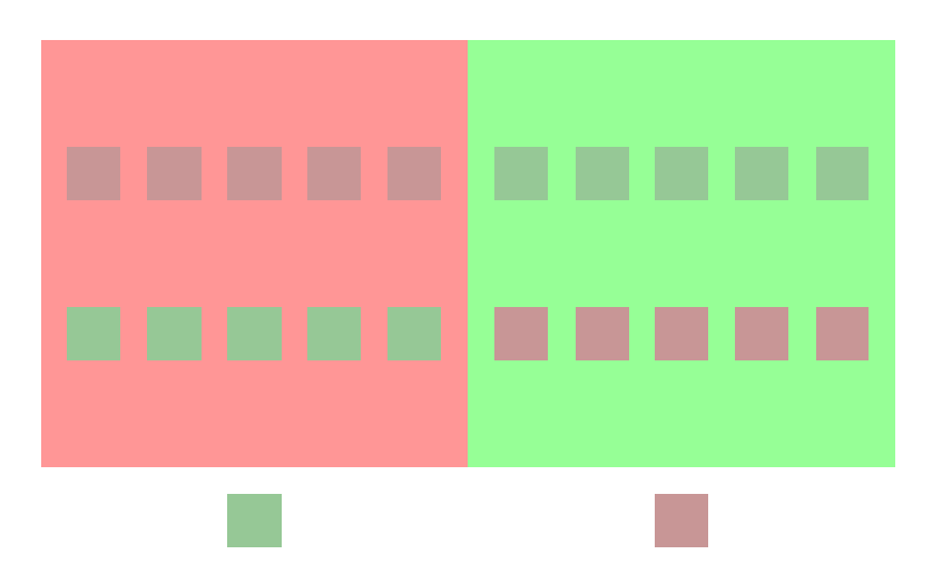
「四色の犬」
上から1番目と3番目の列の犬は2種類、2番目と4番目の列の犬も2種類いるように見えるが、それぞれ同じ色である。色の土牢錯視である。
Copyright Akiyoshi .Kitaoka 2007 (January 5)
土牢錯視(dungeon illusion)(Bressan, 2001)とは?
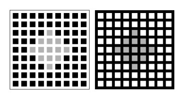
左の「牢屋」の灰色のダイヤモンド形は右のよりも明るく見えるが、物理的には同じ明るさである。
Bressan, P. (2001) Explaining lightness illusions. Perception, 30, 1031-1046.
色の土牢錯視とは?
左の「牢屋」のダイヤモンド形はオレンジ色に、右のは少し紫がかった赤に見えるが、物理的には同じ色である。
引用文献は調査中(ないかもしれない)
色の土牢錯視は雰囲気はムンカー錯視だが、普通に色の同化で説明することも可能だし、ゲシュタルト要因を考えて色の対比というのもあるのかもしれない。

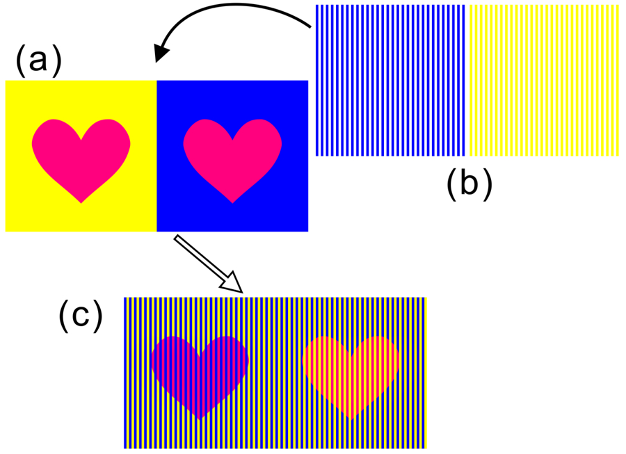
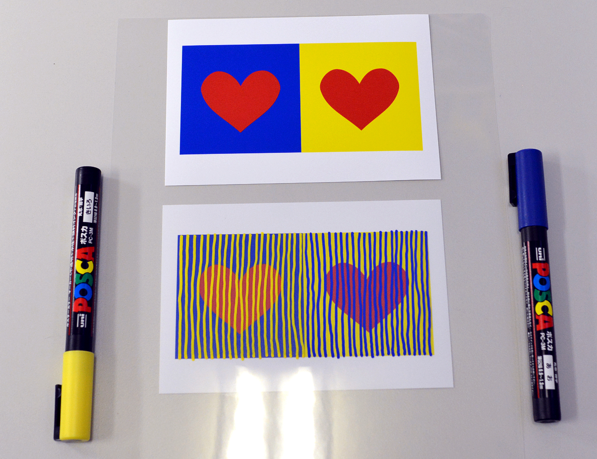
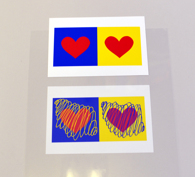
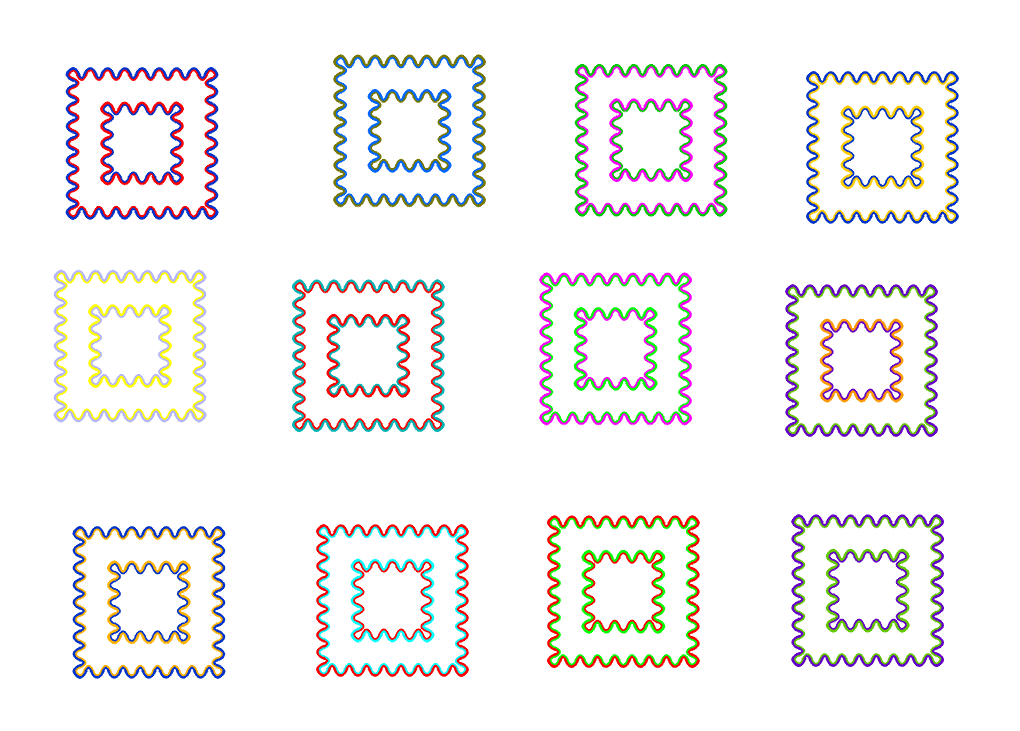
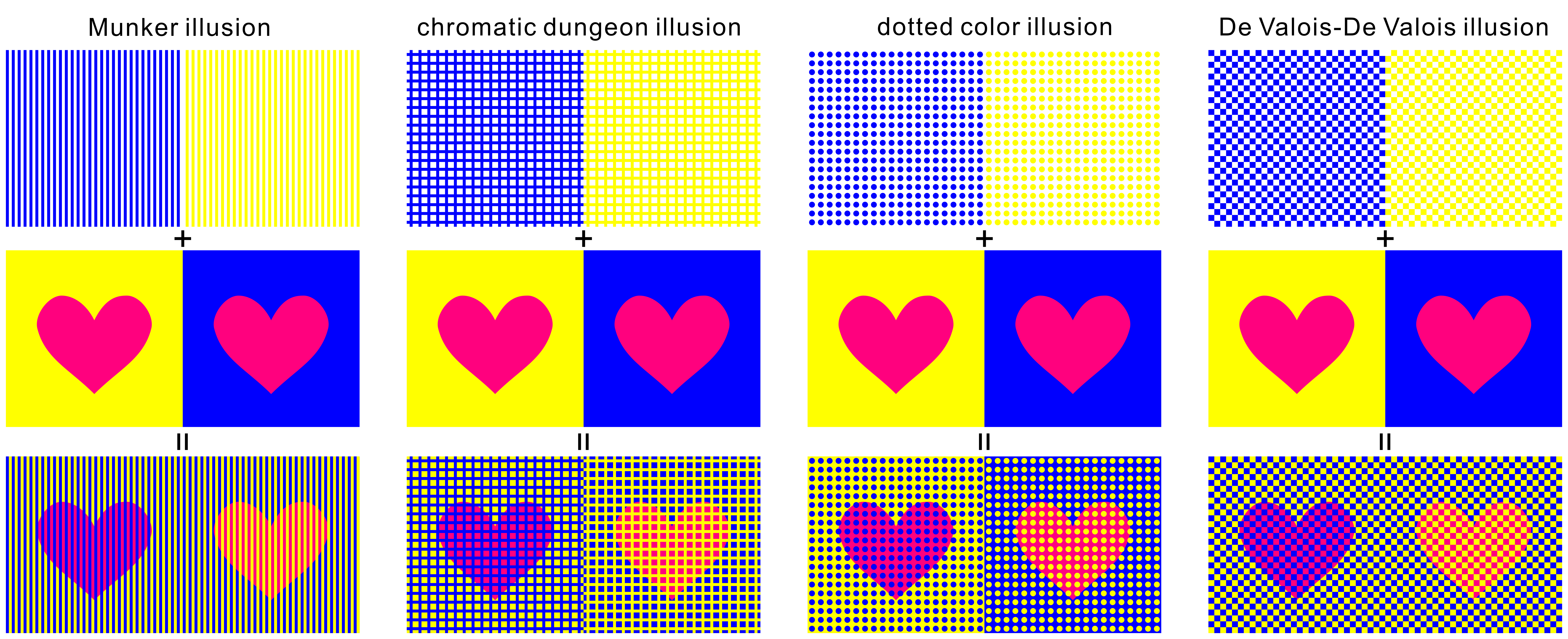
「4種類の色の錯視の作り方」
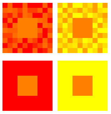
物理的に同じ色(R=255, G=0, B=127)のハートが錯視によってピンクとオレンジのハートに見える。左から、ムンカー錯視(Munker illusion)、色の土牢錯視(chromatic dungeon illusion)、ドット色錯視(dotted color illusion)、デヴァロイス・デヴァロイス錯視(De Valois-De Valois illusion)である。 上図の高解像度ファイルはこちら(8000 x 3262 pixel, 10MB)。
Copyright Akiyoshi Kitaoka 2009 (June 1)
References
| Munker illusion | Munker, H. (1970) Farbige Gitter, Abbildung auf der Netzhaut und übertragungstheoretische Beschreibung der Farbwahrnehmung. Habilitationsschrift, Ludwig-Maximilians-Universität, München. |
| chromatic dungeon illusion | For the dungeon illusion: Bressan, P. (2001) Explaining lightness illusions.
Perception, 30, 1031-1046. Kitaoka (2007) http://www.psy.ritsumei.ac.jp/~akitaoka/saishin22e.html |
| dotted color illusion | For the dotted brightness illusion: White, M. (1982) The assimilation-enhancing effect of a dotted surround upon a dotted test region. Perception, 11, 103-106. Kitaoka (2008) http://www.psy.ritsumei.ac.jp/~akitaoka/color10e.html |
| De Valois-De Valois illusion | De Valois, R. L. and De Valois, K. K. (1988) Spatial Vision. New York: Oxford University Press. |
北岡明佳 (2012) 色の錯視いろいろ (4) 簡単で錯視量の多い色相の錯視図形の作り方 日本色彩学会誌, 36(1), 45-46. PDF(スキャンコピー) <配布資料>
「ムンカー錯視の工作セット」
ホワイト効果の工作セット。用意するものは、明るさの対比図形1枚、ポスターカラーマーカー白と黒1本ずつ(細字がよい)、OHPシート。OHPシートを使わず直接描き込んでもよい。
Copyright Akiyoshi Kitaoka 2015 (June 9)
台紙 (クリックして高解像度ファイルをダウンロード)
Copyright Akiyoshi Kitaoka 2015 (June 29)
Copyright Akiyoshi Kitaoka 2015 (July 9)
---
黄ばみ錯視
台紙 (クリックして高解像度ファイルをダウンロード)
Copyright Akiyoshi Kitaoka 2016 (February 17)
「ホワイト効果の工作セット」
ホワイト効果の工作セット。用意するものは、明るさの対比図形1枚、ポスターカラーマーカー白と黒1本ずつ(細字がよい)、OHPシート。OHPシートを使わず直接描き込んでもよい。
Copyright Akiyoshi Kitaoka 2015 (June 7)
台紙 (クリックして高解像度ファイルをダウンロード)
White, M. (1979) A new effect on perceived lightness. Perception, 8, 413-416.
<色の恒常性的錯視>
問: 下記のような色から、オレンジ色と赤紫色を同時に作る方法はあるか?
Make orange color and red-purple color from the three color shown below.
答: ある。
You can do like this.
Produced Akiyoshi Kitaoka 2012 (September 16)
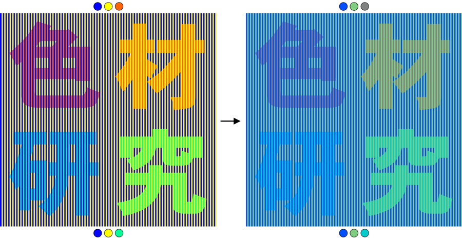
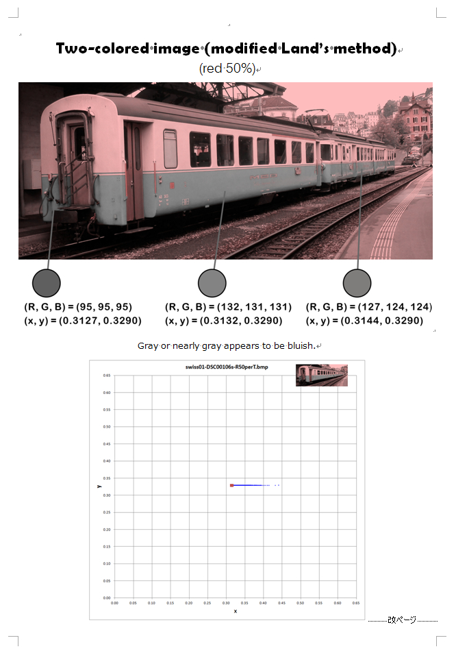
「ムンカー錯視と色の恒常性の色材研究」
Munker illusion and its "color constantancy illusion"
左の「色材」は赤が赤紫とオレンジに見え、「研究」は水色と黄緑色に見える。右の「色材」は灰色が赤紫とオレンジに見え、「研究」は青緑色が水色と黄緑色に見える。
There appear red purple and orange characters but they are the same red
in the left image and the same gray in the right image.
Copyright Akiyoshi Kitaoka 2012 (September 16)
色の錯視の色の恒常性図形の作り方
How to make an image which demonstrates the color constancy illusion of
color illusion
Copyright Akiyoshi Kitaoka 2012 (December 7)
問: 下記のような色から金色を作る方法はあるか?
Make gold color from such colors shown below.
答: ある。
You can do like this.
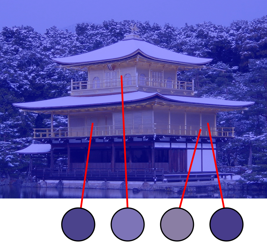
「青い金閣」
"Bluish Golden Palace"
青フィルターがかかっていやな感じではあるが金閣は金色に見える。金色は黄色系統でなければならないという前提があるなら、この合成画像で金閣が金色に見えることは錯視であり、知覚される金色は物理的には青系統の色である。
Copyright Akiyoshi Kitaoka 2011 (July 14)
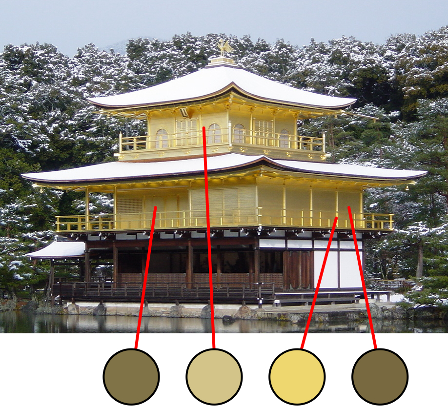
Golden Palace
黄色系統でなくても金色に見える。
Gold color can be made from bluish colors.
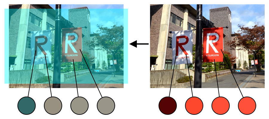
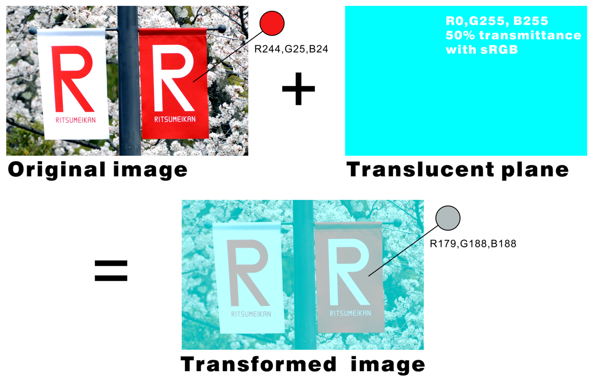
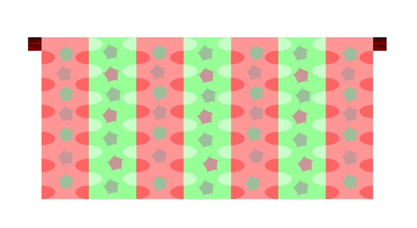
「立命館大学ののぼりの色の恒常性」
"Ritsumeikan flags"
Copyright Akiyoshi Kitaoka 2012 (November 30)
色の恒常性錯視デモ用のプリント用ファイル DOC

References
北岡明佳 (2011) 色の錯視いろいろ (2)色の恒常性と2つの色フィルタ 日本色彩学会誌, 35(3), 234-236. PDF(スキャンコピー), PDF(高解像度スキャンコピー)
北岡明佳 (2011) 色の錯視いろいろ (1)「目の色の恒常性」という錯視の絵 日本色彩学会誌, 35(2), 118-119. PDF(スキャンコピー)
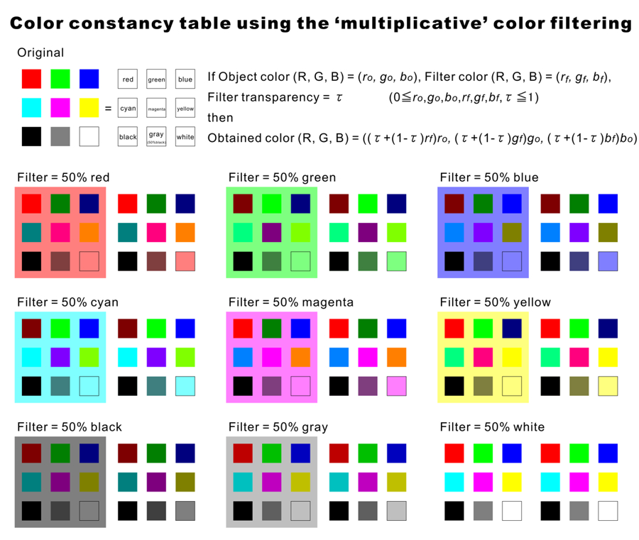
加法的色変換
Additive color changes
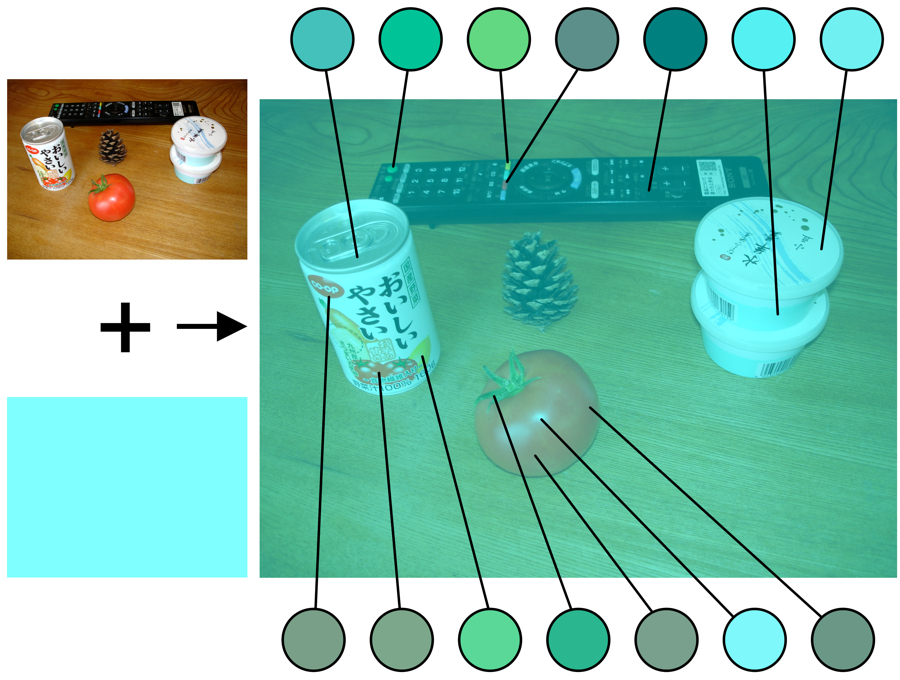
北岡明佳 (2011) 色の錯視いろいろ (2)色の恒常性と2つの色フィルタ 日本色彩学会誌, 35(3), 234-236. <図2>

乗法的色変換
Multiplicative color change
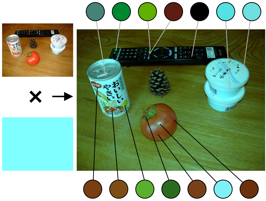
北岡明佳 (2011) 色の錯視いろいろ (2)色の恒常性と2つの色フィルタ 日本色彩学会誌, 35(3), 234-236. <図4>
北岡明佳 (2011) 色の錯視いろいろ (2)色の恒常性と2つの色フィルタ 日本色彩学会誌, 35(3), 234-236. PDF(スキャンコピー), PDF(高解像度スキャンコピー)
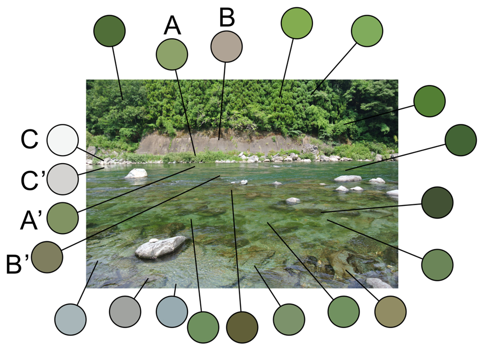
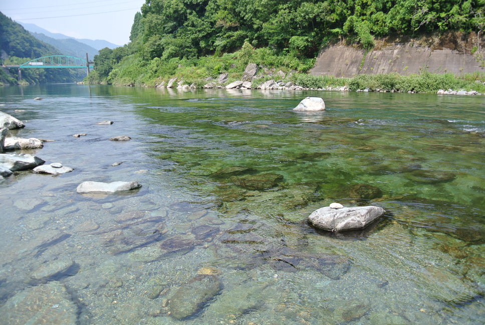
加法的色変換の例・・・「清流」の緑は山の緑
Example of additive color changes
Copyright Akiyoshi Kitaoka 2013 (August 3)
「色の恒常性による両眼闘争の抑制」
"No binocular rivalry in the color constancy eye"
2つの図を両眼融合して見ると、左目はオレンジ色と緑色の間の両眼闘争を起こすが、右目は黄色に見えたままである。しかし、右目は左目と同じく、物理的にはオレンジ色と緑色なのである。
Try to fuse them binocularly. Then, the left eye shows binocular rivalry
between orange and green, while the right eye does not. This observation
is remarkable since the right eye is the same color as the left eye in
each image.
Copyright Akiyoshi Kitaoka 2009 (June 29)
色の恒常性は高次な知覚という先入観が私にはあったが、本図は低次処理の証拠となるかもしれない。
This phenomenon might suggest that color constancy should reflect a rather
low-level visual process.
「色の恒常性による両眼闘争」
"Binocular rivalry in the color constancy eye"
2つの図を両眼融合して見ると、右目はシアン色(水色)と赤色の間の両眼闘争を起こすことがあるが、左目は灰色に見えたままである。しかし、どちらの右目も左目と同じく、物理的には灰色なのである。
Try to fuse them binocularly. Then, the right eye sometimes shows binocular
rivalry between cyan and red, while the left eye does not. This observation
is remarkable since the right eye is the same gray for each image.
Copyright Akiyoshi Kitaoka 2009 (June 29)
両眼の情報が統合される前に色の恒常性が成立していないと両眼闘争はしないよね・・・その論理でいいのか??
This phenomenon might also support the idea that color constancy should
reflect a rather low-level visual process.

Limited case: "No binocular rivalry in the color constancy eye"
Limited case: "Binocular rivalry in the color constancy eye"
Copyright Akiyoshi Kitaoka 2013 (October 22)
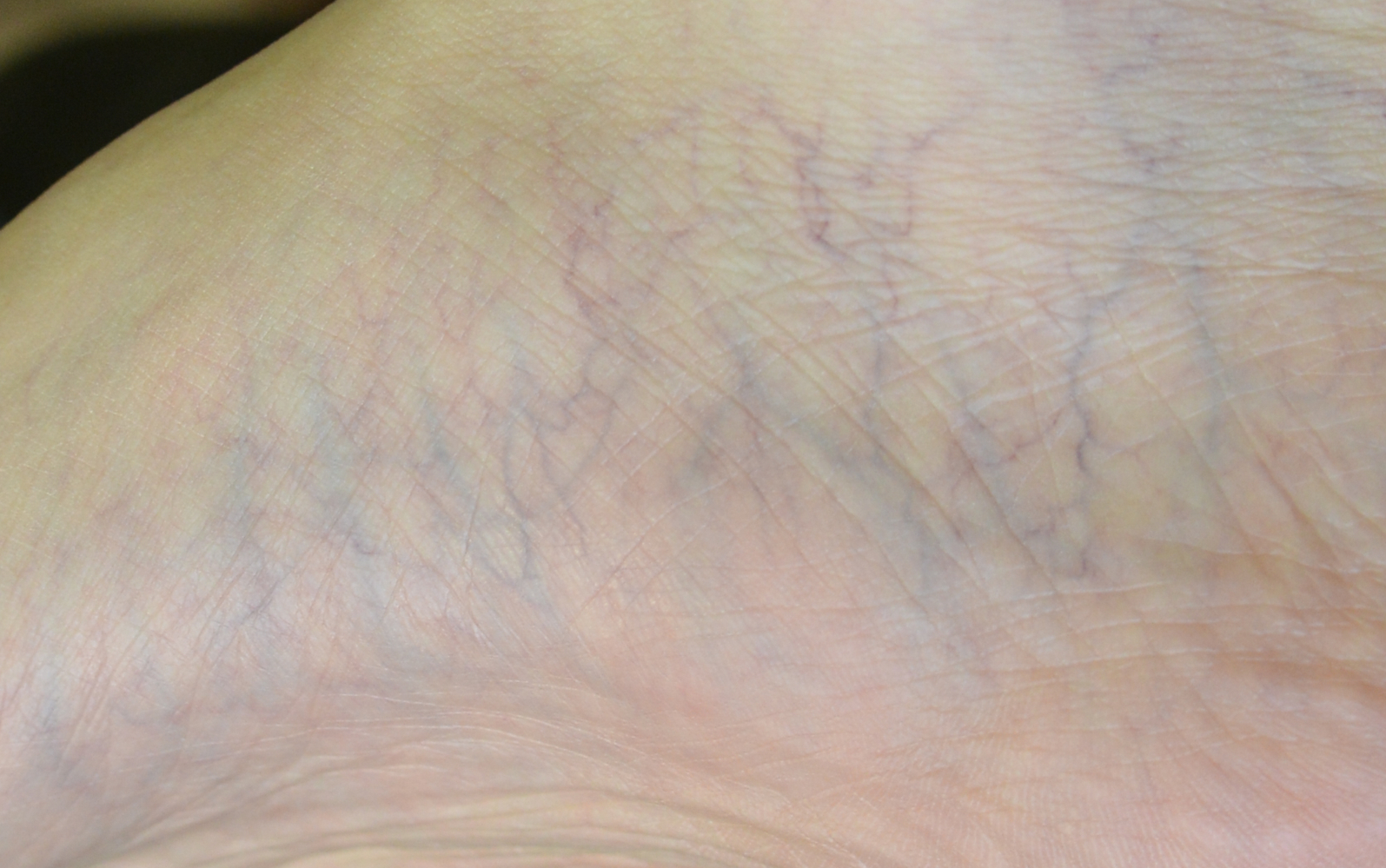
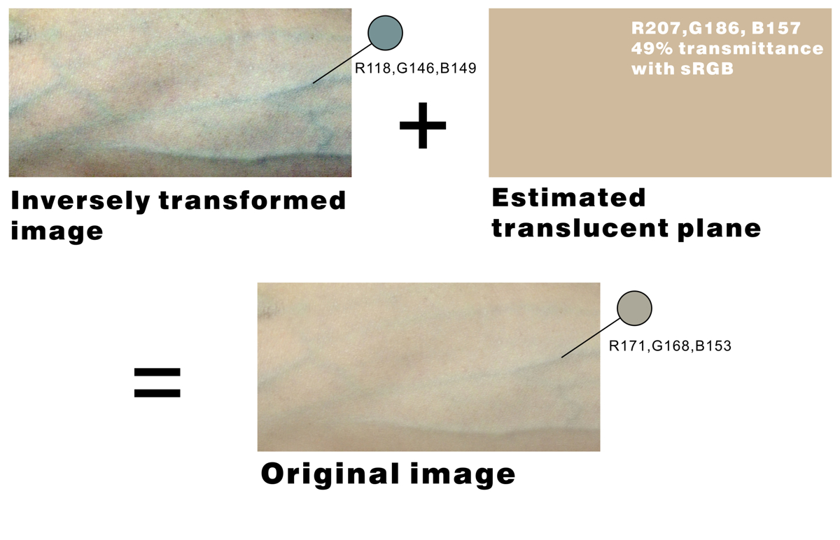
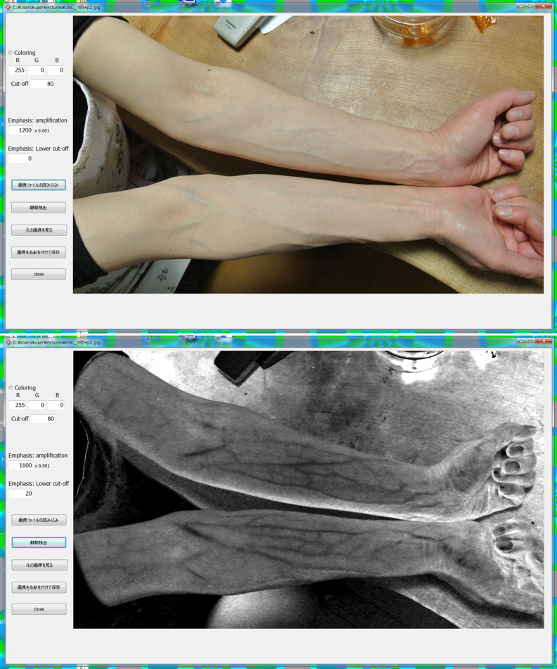
< 静脈錯視 >
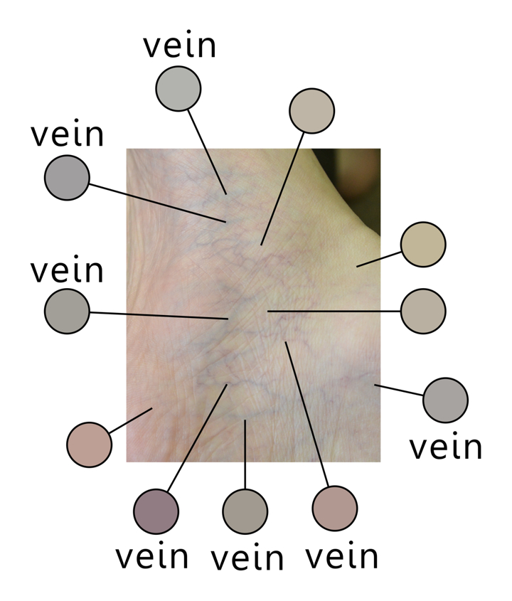
「静脈錯視」
青く浮き出て見える静脈は物理的には青くなく、せいぜい灰色であり、色の錯視(色の対比)だった!
Copyright Akiyoshi Kitaoka 2014 (April 23)
写真は北岡の右足です。
静脈錯視発見の時のfacebookページ→ ![]()
類似の錯視
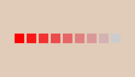
一番右の正方形は灰色であるが水色に見える。
Copyright Akiyoshi Kitaoka 2014 (April 23)
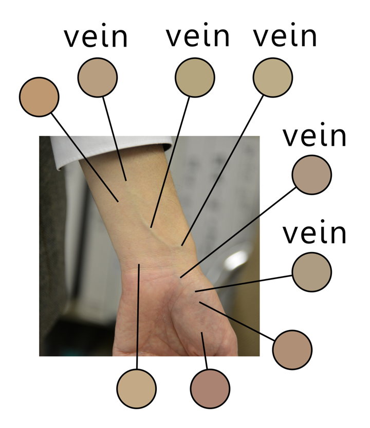
「静脈錯視:手」
この手の青く浮き出て見える静脈は物理的には青くなく、彩度の低いオレンジ色であった。
Copyright Akiyoshi Kitaoka 2014 (April 23)
写真は北岡の右手です。對梨成一氏撮影。
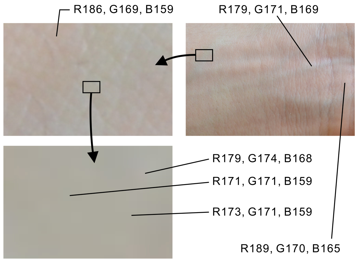
下2図は、物理的には青いピクセルはないことをスポイトツールなどで確めるための画像
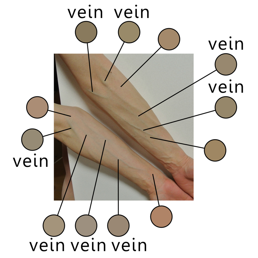
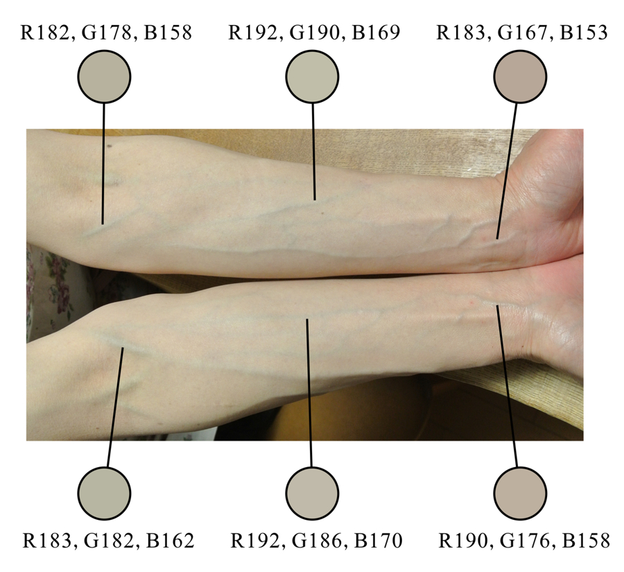
「静脈錯視:腕」
この手の青く浮き出て見える静脈は物理的には青くなく、彩度の低いオレンジ色であった。
Copyright Akiyoshi Kitaoka 2014 (April 24)
Thanks to MK for your tremendous contribution!
「静脈錯視:腕 2」
青白く撮れた写真の場合でも、この手の青く浮き出て見える静脈は物理的には青くなく、彩度の低い黄色かオレンジ色であった。
Copyright Akiyoshi Kitaoka 2014 (April 24)
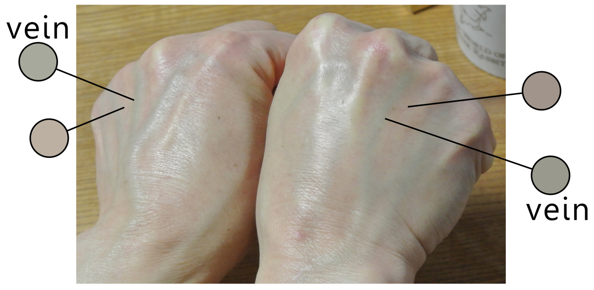
「静脈錯視:手の甲」
この手の青く浮き出て見える静脈は物理的には青くなく、ほぼ灰色あるいは彩度の低い黄色であった。
Copyright Akiyoshi Kitaoka 2014 (April 24)
「静脈錯視:基本図形?」
ほとんど灰色の彩度の低い黄色の領域が青みがかって見える。
Copyright Akiyoshi Kitaoka 2014 (April 24)
静脈錯視についての皆様からのご意見→ ![]()

「錯視的青のリング」
本図はすべて少し赤みの入った黄色の色相の画素でできているが、青みを帯びたリングが知覚される。
produced Akiyoshi Kitaoka 2014 (May 31)

「錯視的青のリング 2」
本図はすべて少し赤みの入った黄色の色相の画素でできているが、青みを帯びたリングが知覚される。
produced Akiyoshi Kitaoka 2014 (May 31)
< 誘導色の彩度が低くても効果がある。>

「錯視的水色のリング」
本図はすべて赤の色相の画素でできているが、水色を帯びたリングが知覚される。
produced Akiyoshi Kitaoka 2014 (May 31)

「錯視的赤みのリング 2」
本図はすべて水色(シアン)色の色相の画素でできているが、赤みを帯びたリングが知覚される。
produced Akiyoshi Kitaoka 2014 (May 31)
ここで加法的色変換とその逆変換
オリジナルの写真 (2015年5月3日@須磨離宮公園)
透明度50%で白と合成した画像 (各ピクセルのRGB値はオリジナルの50%の値と白の50%の値を足したもの)
(MA_color_change04.exe を使用。ただし、bmpファイル専用。jpegファイル用はこちら → MA_color_change04jpeg.exe)
透明度10%で白と合成した画像 (各ピクセルのRGB値はオリジナルの10%の値と白の90%の値を足したもの)
上の 「透明度10%で白と合成した画像」 を乗法的色変換の逆変換プログラムにかけて復元した画像
(AM_color_inverse03.exe を使用。ただし、bmpファイル専用。jpegファイル用はこちら → AM_color_inverse03jpeg.exe)
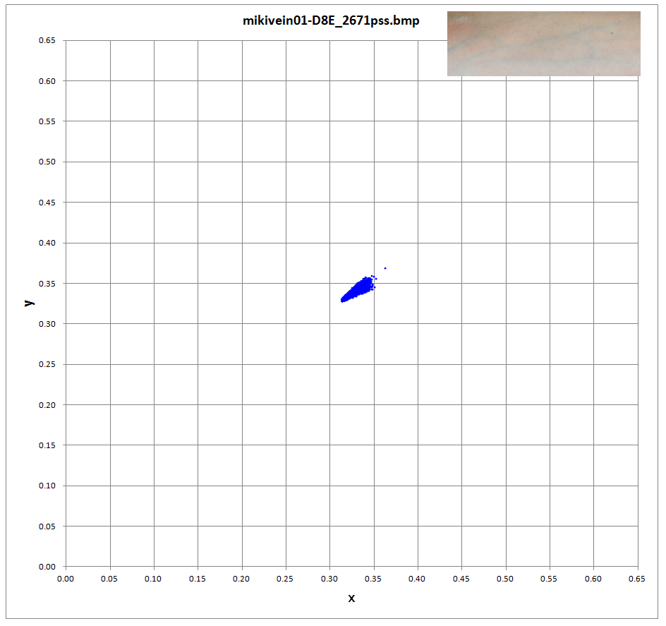
color constancy illusion
vein color illusion

Kitaoka, A. (2015). Color constancy and the vein color illusion. 38th European Conference on Visual Perception (ECVP) (Liverpool), Poster 2P1M060, August 25, 2015. Presentation (html) --- Poster (doc)
< 静脈錯視の応用 >
「静脈錯視を応用した静脈可視化ツール」
vein_visualization02JPEG.exe
Before (上) After (下)
Copyright Akiyoshi Kitaoka 2014 (April 27)
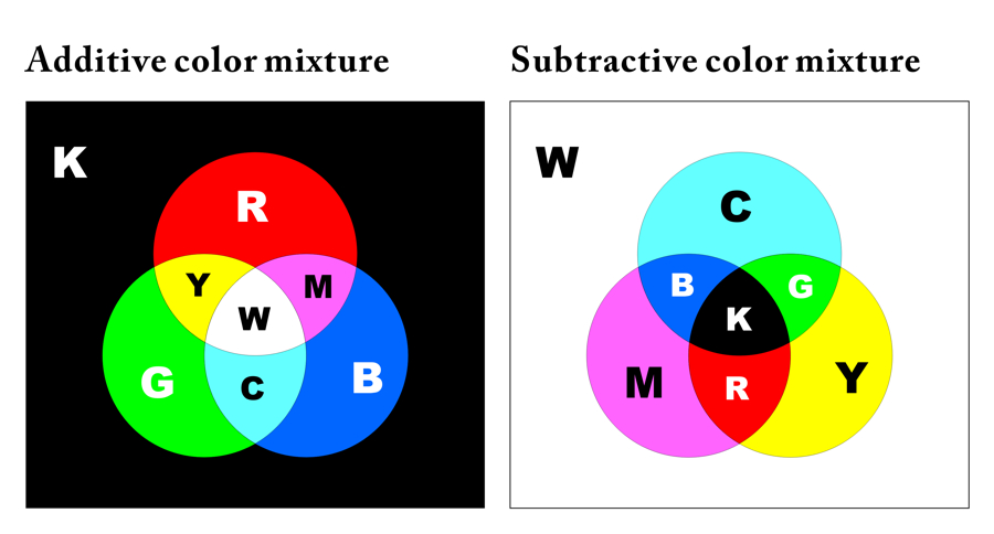
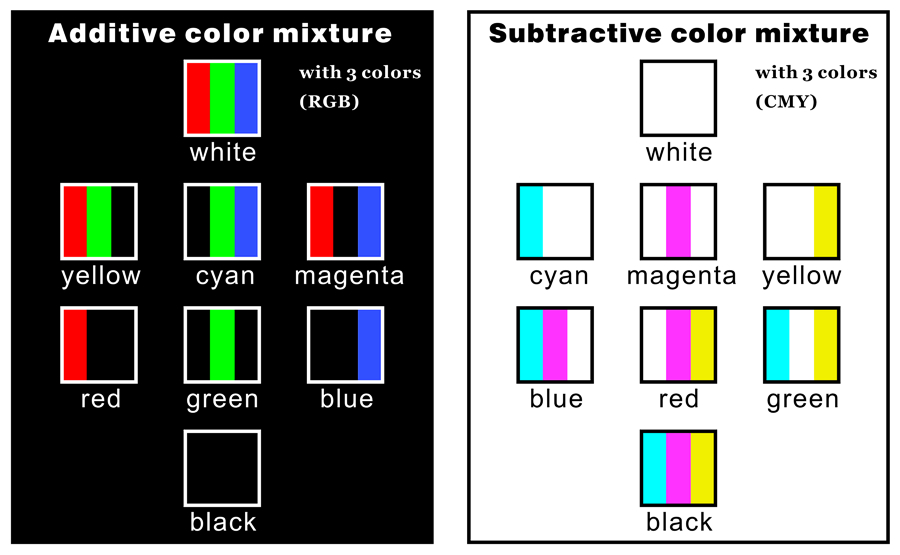
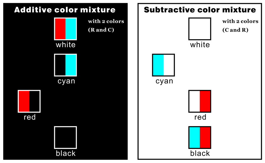
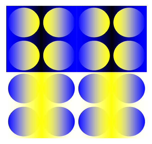
並置混色には2種類ある
Spatial color mixture: additive color mixture (top) and subtractive one (bottom)
加法混色
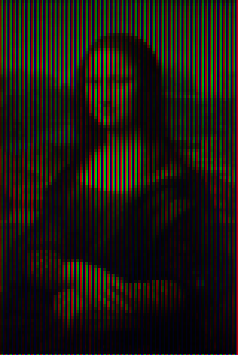
減法混色
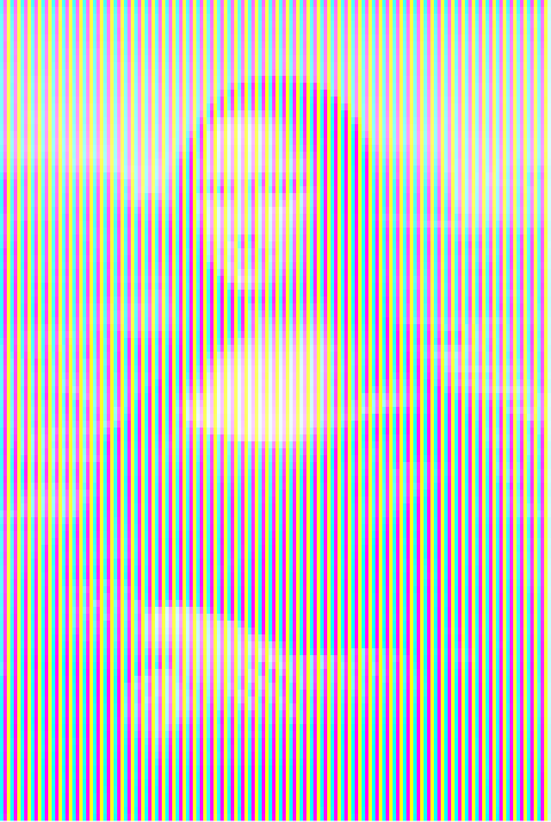
Spatial color mixture: additive color mixture (left) and subtractive one (right)
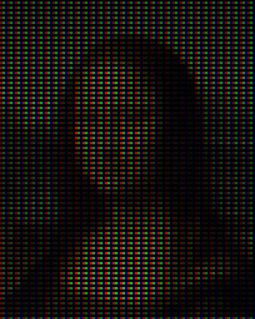
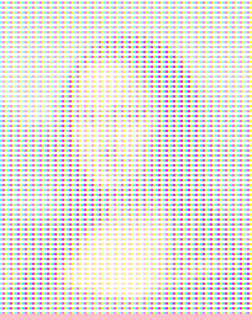
Spatial color mixture: additive color mixture (left) and subtractive one (right)
Spatial color mixture: additive color mixture (left) and subtractive one (right)
Spatial color mixture: additive color mixture (left) and subtractive one (right)
Spatial color mixture: additive color mixture (left) and subtractive one (right)
Spatial color mixture with three colors: additive color mixture (top) and subtractive one (bottom)
Spatial color mixture with three colors: additive color mixture (left) and subtractive one (right)

Spatial color mixture with three colors: additive color mixture (left) and subtractive one (right)
Spatial color mixture with three colors: additive color mixture (left) and subtractive one (right)
オリジナル図

加法混色(左) と 減法混色(右)
Spatial color mixture with two colors (red and cyan): additive color mixture (left) and subtractive one (right)
s.jpg)
s.jpg)
.jpg)
.jpg)
オリジナル図


s.jpg)
bs.jpg)
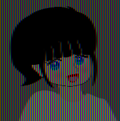
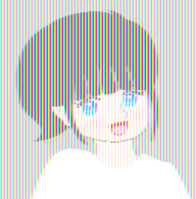
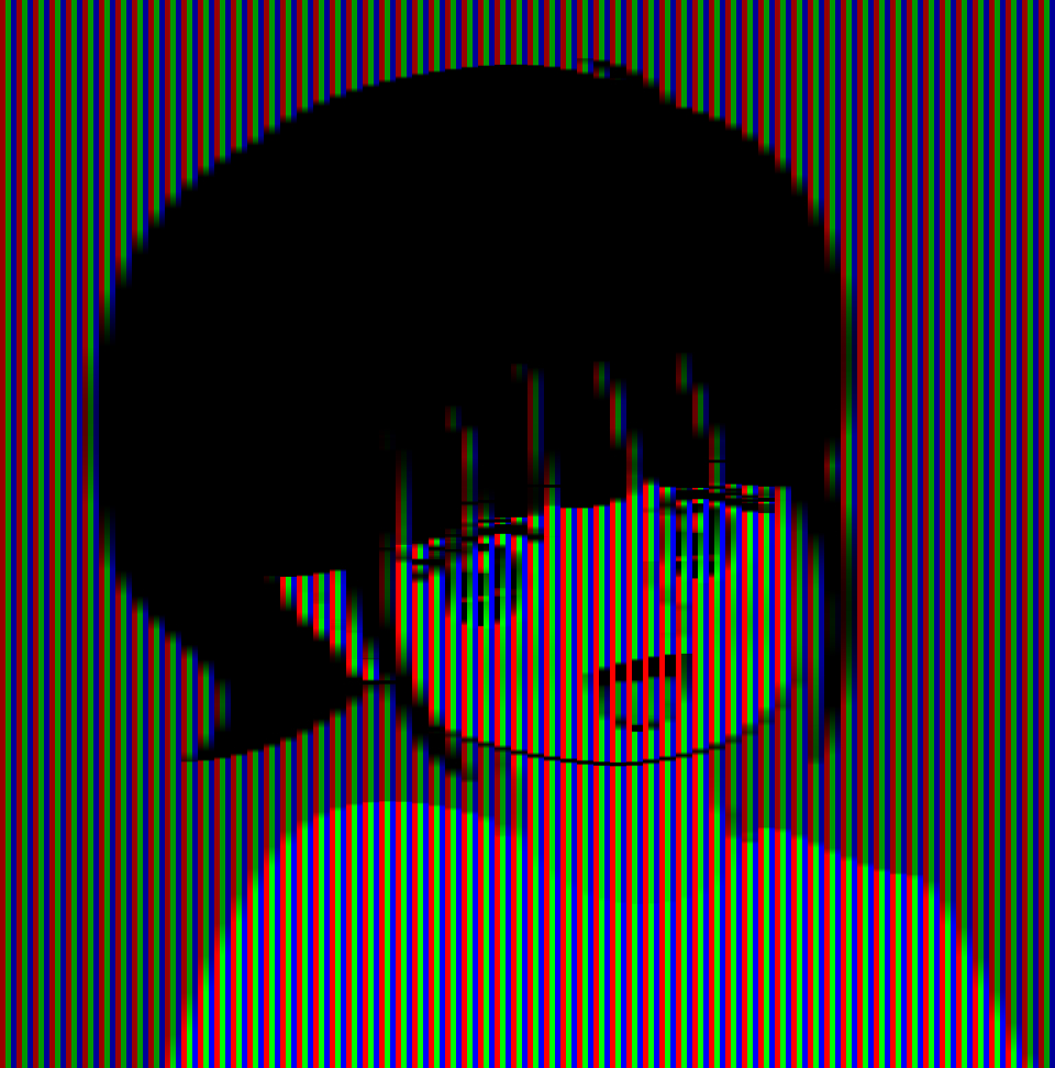
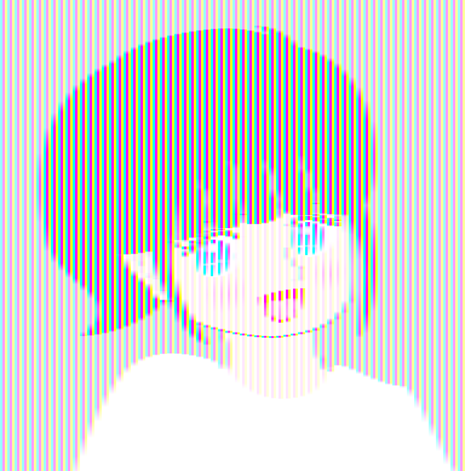
「黒い髪と服のおねえさんと白い髪と服のおねえさん」
髪と服はどちらも赤色とシアン色の縞模様でできていて同じであるが、減法混色か加法混色かの違いによってぞぞれ黒と白に見える。
Copyright Akiyoshi Kitaoka 2015 (July 15)
拡大画像
.jpg)
b.jpg)
さらなる拡大画像
Lp.jpg)
bLp.jpg)
bhH2.jpg)
あしゅら男爵化
b-RC(RGB)s.gif)
早変わり
(GIF アニメ)
明るさの恒常性錯視との関係
加法混色 減法混色
h.jpg)
bh.jpg)
.jpg)
.jpg)
↓↑ 類似 ↓↑ 類似


↑ 乗法的色変換(黒50% sRGB) ↑ 加法的色変換(白50% sRGB)


![]()
![]()
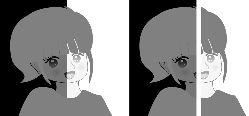
「あしゅら男爵錯視」
髪と服は左半身と右半身がくっついていると同じ灰色であることがわかるが(左)、離れていると明るさが異なって見える(左が明るく右が暗く見える)(右)。コフカの環(下図A)と同型。
Copyright Akiyoshi Kitaoka 2015 (September 5)
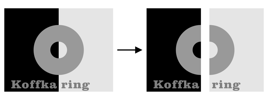
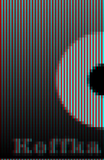
図地分離錯視との関係
(再掲)
↓ 等間隔に黒線を乗せる ↓ 等間隔に白線を乗せる

左右とも髪と服は白と黒の縞模様でできていて全く同じであるが、左は白く見え、右は黒く見える。


↓ 等間隔に黒線を乗せる ↓ 等間隔に白線を乗せる
左右とも髪と服は白と黒の縞模様でできていて全く同じであるが、左は白く見え、右は黒く見える。
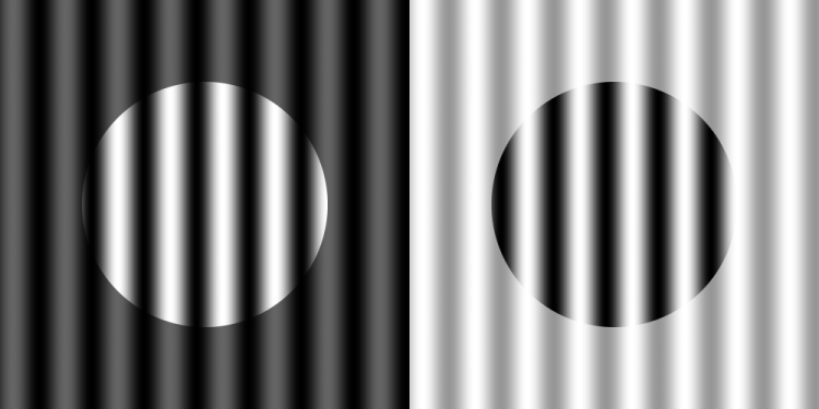
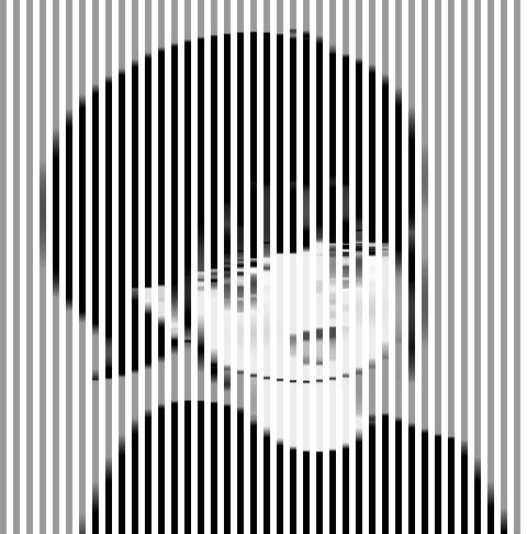
「図地分離による明るさ錯視」・・・左右の円内は同じ縞模様であるが、左は白い円、右は黒い円が見える。
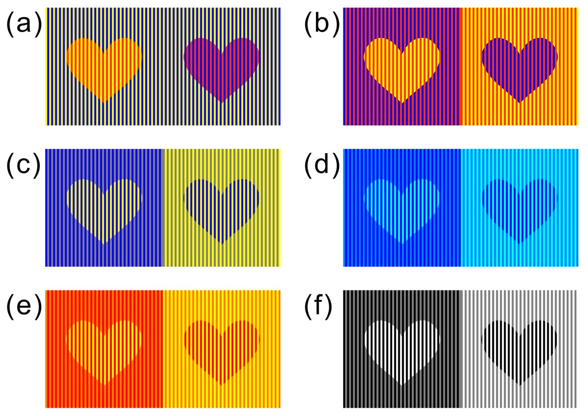
北岡明佳 (2012) 色の錯視いろいろ (6) 図地分離による錯視 日本色彩学会誌, 36(3), 237-238. PDF(スキャンコピー)

↓ 等間隔に黒線を乗せる ↓ 等間隔に白線を乗せる
左右とも髪と服は黄と青の縞模様でできていて全く同じであるが、左は黄に見え、右は青に見える。
あしゅら男爵化

早変わり
(GIF アニメ)
アンダーソン錯視との関係
↓ グレースケールパターンで乗法的色変換 ↓ グレースケールパターンで加法的色変換
左右とも髪と服はグレースケールの雲模様でできていて全く同じであるが、左は白く見え、右は黒く見える。
Anderson's illusion
Anderson, B. L. and Winawer, J. (2005) Image segmentation and lightness perception. Nature, 434, 79-83.
The inset surrounded by the darker background appears to be lighter than the same pattern surrounded by the brighter background.
See Bart's Homepage
(Lightness scission)
The chromatic Anderson's illusion is possible.
Wollschläger, D. and Anderson, B.L. (2009) The role of layered scene representations in color appearance. Current Biology, 19, 430-435.
The inset surrounded by the bluish background appears to be yellowish while the inset surrounded by the yellowish background appears to be bluish.
Chromatic Anderson's illusion does not depend on colour contrast, as shown
below.
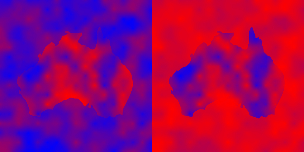
"Australia seen from space and dust storm over Australia"
The two Australia shapes are physically the same color and texture, but the left Australia appears to be reddish while the right one appears to be bluish with red dust storm blanketing it. This effect depends on the chromatic version of Anderson's illusion.
Copyright Akiyoshi .Kitaoka 2009 (September 25)
Anderson, B. L. and Winawer, J. (2005) Image segmentation and lightness perception. Nature, 434, 79-83.
Wollschläger, D. and Anderson, B.L. (2009) The role of layered scene representations in color appearance. Current Biology, 19, 430-435.
(Colour scission)
「『九州の錯視』の作り方」
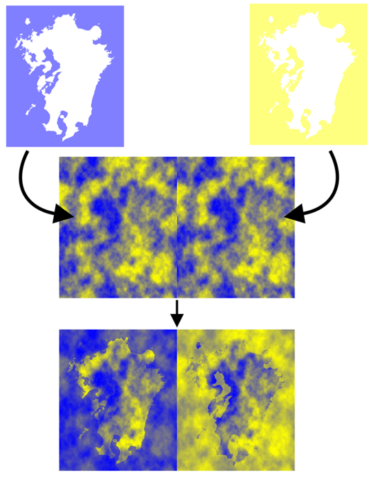

↓ ↓


↓ ↓
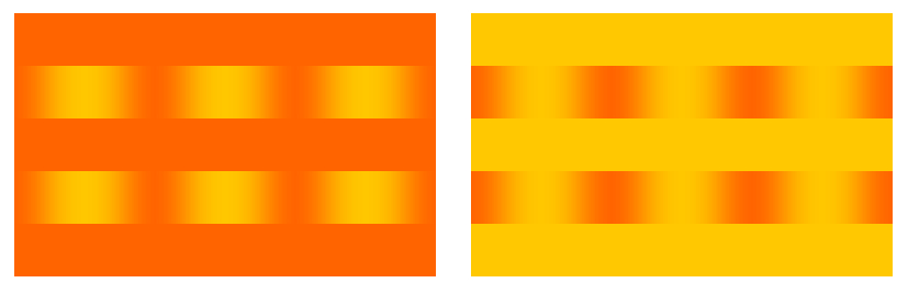
「サーチライト」
黄色のサーチライトが当たっているように見える。各縦列の円の中の色グラデーションは同じであるが、上2つは黄色の円に見え、下2つは青の円に見える。
Copyright Akiyoshi Kitaoka 2005 (December 7)
Color phantoms
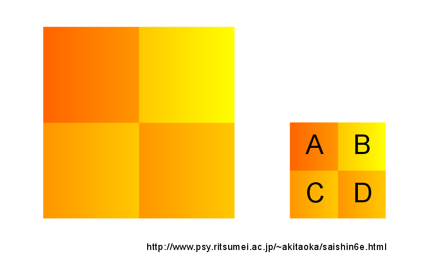
A と D、B と C が同じ感じに見えるが、物理的には C と D が同じである。
Copyright Akiyoshi .Kitaoka 2005 (August 12)
「色勾配と輝度勾配による色・明るさ錯視の工作セット」

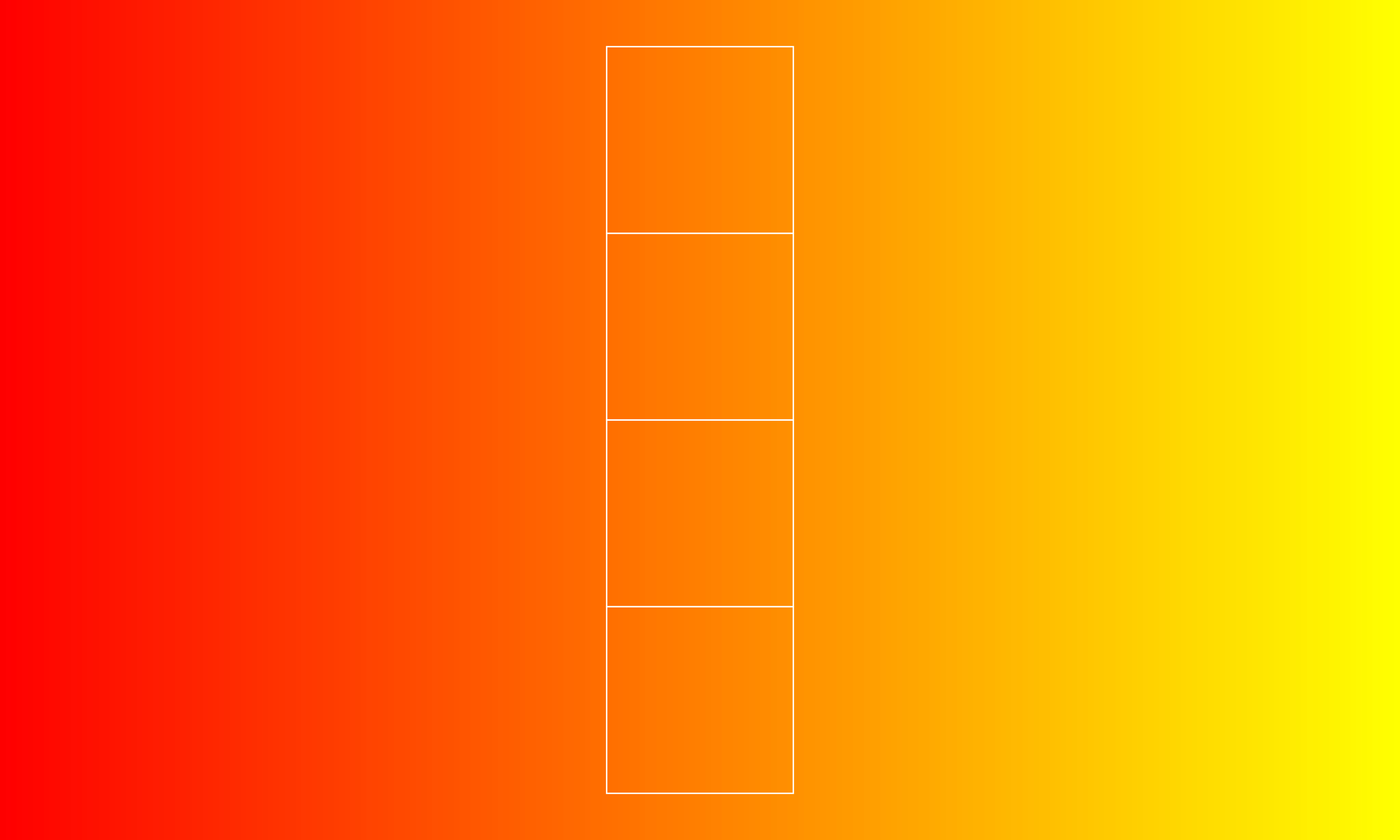
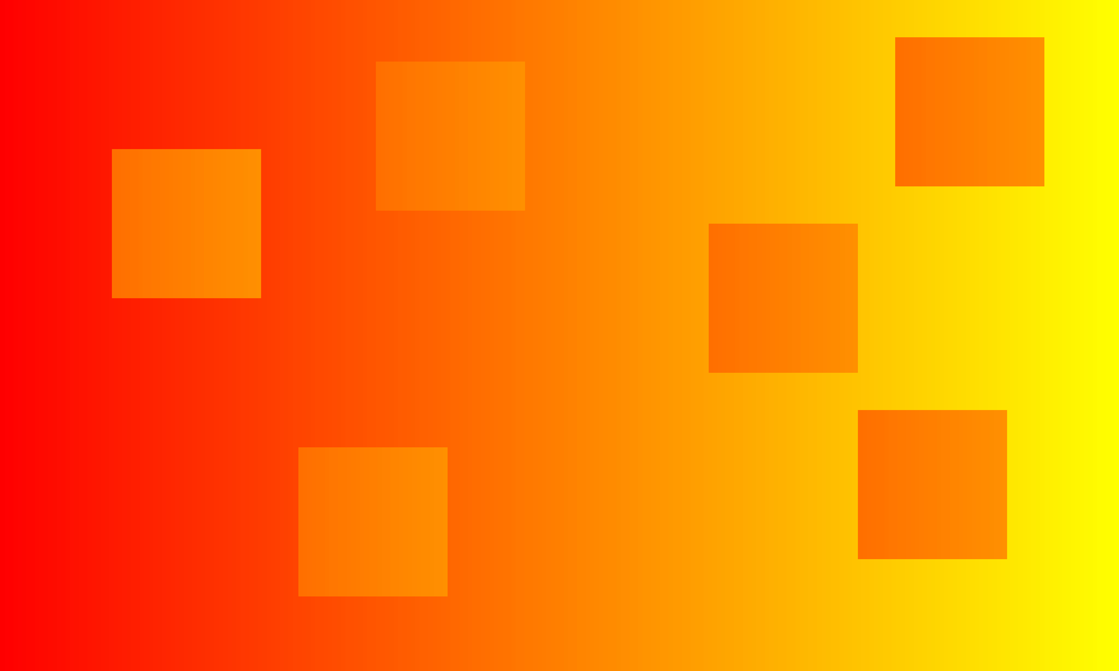
色&輝度勾配画像(色&明るさのグラデーション画像:上図)にその中央部分(中図)を切り取ったものを左右に寄せて配置するとできあがり(左図)。用意するものはハサミと輝度勾配画像。4つの正方形の片は同じ色&輝度(正確には色&輝度グラデーションであるが、一番左は明るく黄色っぽく、一番右は暗く赤っぽく見える。
Copyright Akiyoshi Kitaoka 2015 (November 8)

輝度勾配画像 (クリックして高解像度ファイルをダウンロード)
切り取り用輝度勾配画像 (クリックして高解像度ファイルをダウンロード)
グラフィクスによる作例(クリックして高解像度ファイルをダウンロード)
Copyright Akiyoshi Kitaoka 2015 (November 8)
動画デモ colorgradation01-00240.mp4
Copyright Akiyoshi Kitaoka 2015 (November 8)
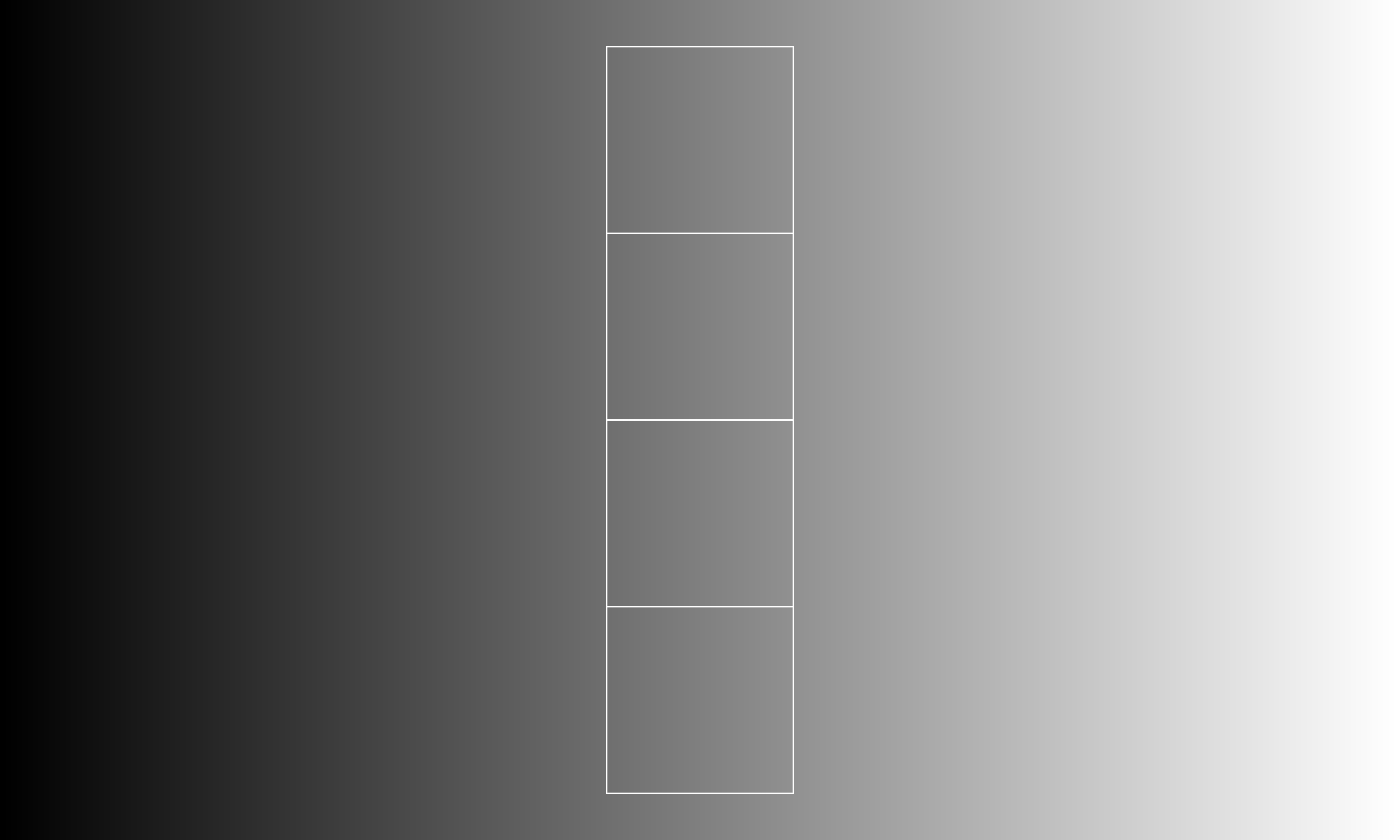
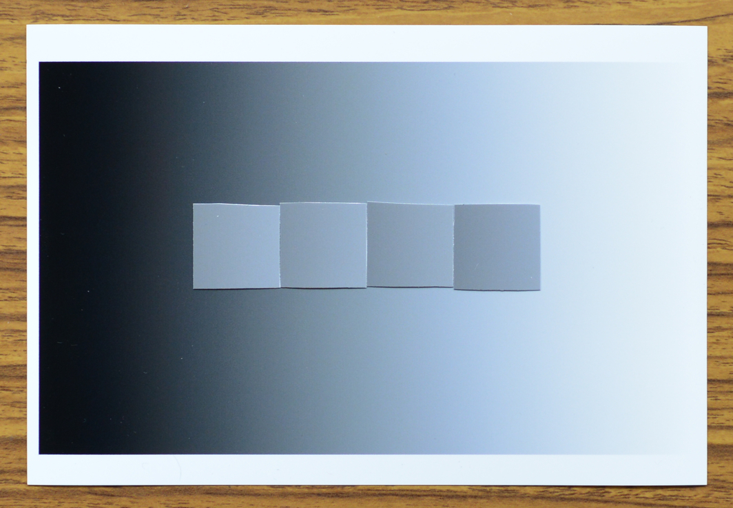
「輝度勾配による明るさ錯視の工作セット」
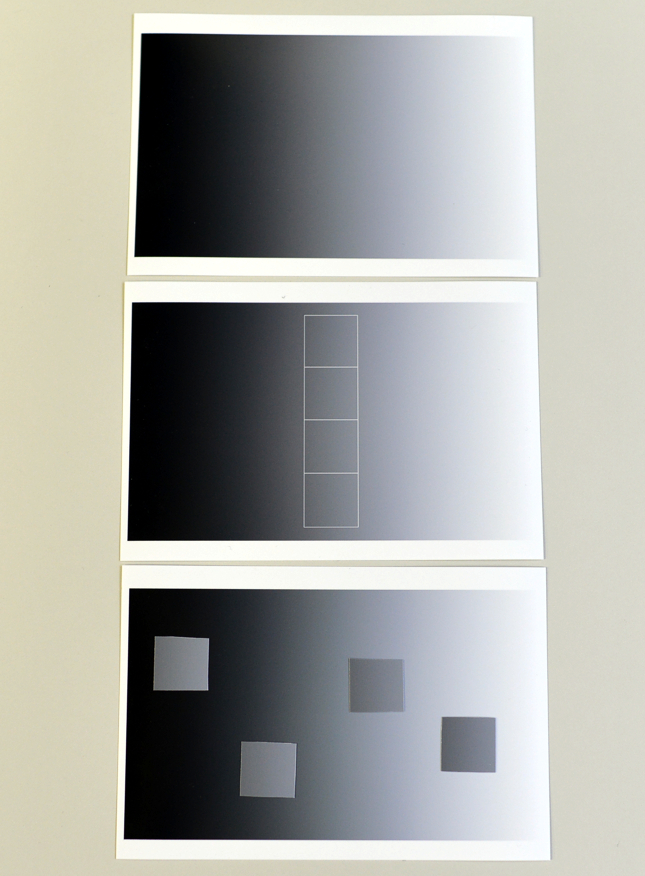
輝度勾配画像(明るさのグラデーション画像:上図)にその中央部分(中図)を切り取ったものを左右に寄せて配置するとできあがり(左図)。用意するものはハサミと輝度勾配画像。4つの正方形の片は同じ輝度(正確には輝度グラデーションであるが、一番左は明るく、一番右は暗く見え、中間のは中間の明るさに見える。
Copyright Akiyoshi Kitaoka 2015 (July 4)

輝度勾配画像 (クリックして高解像度ファイルをダウンロード)
切り取り用輝度勾配画像 (クリックして高解像度ファイルをダウンロード)
グラフィクスによる作例(クリックして高解像度ファイルをダウンロード)
Copyright Akiyoshi Kitaoka 2015 (July 4)
Copyright Akiyoshi Kitaoka 2015 (July 4)
Copyright Akiyoshi Kitaoka 2015 (November 18)
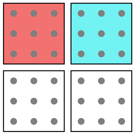
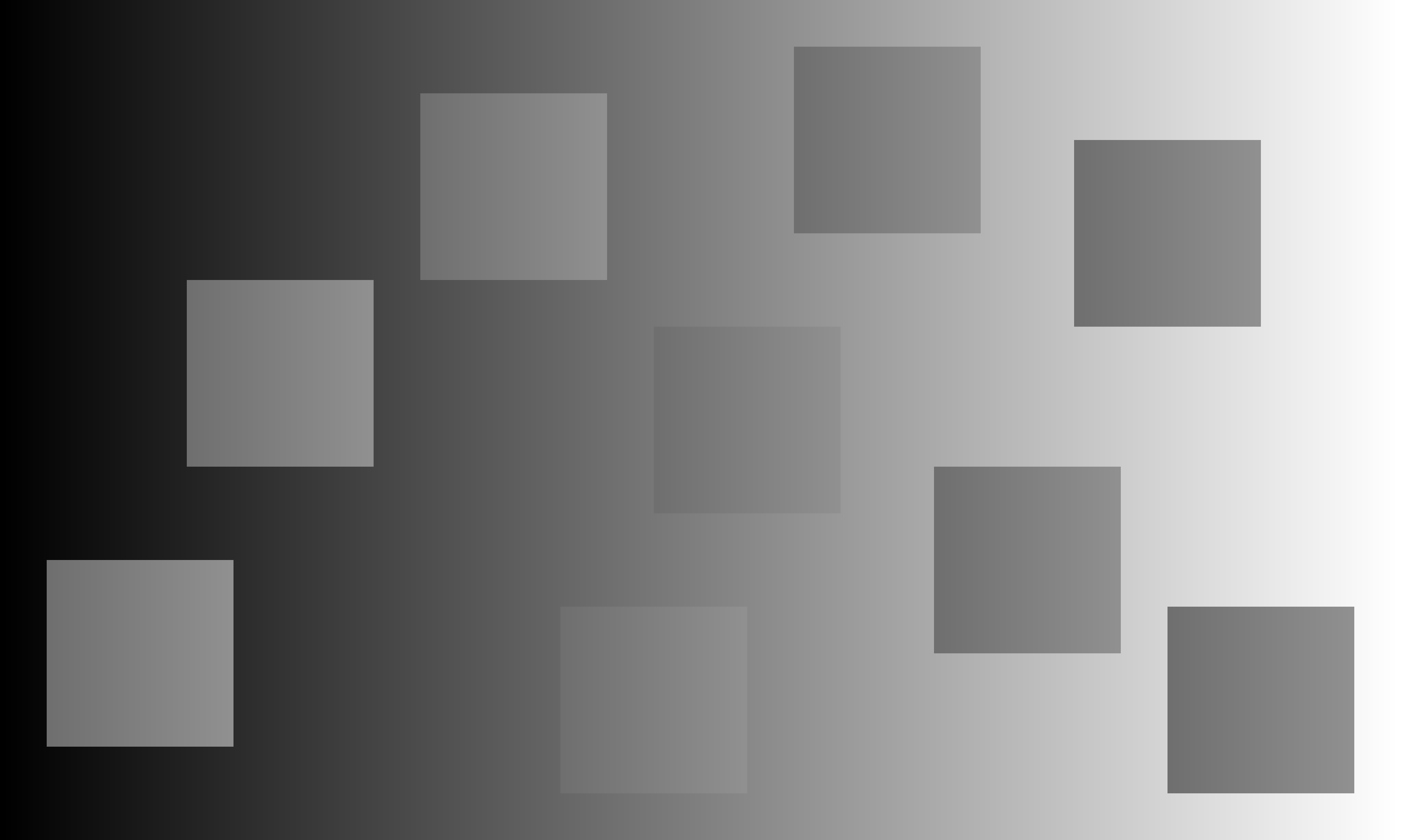
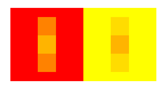
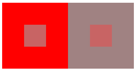
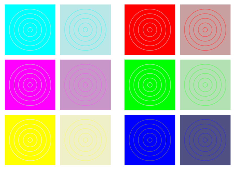
<色の対比>
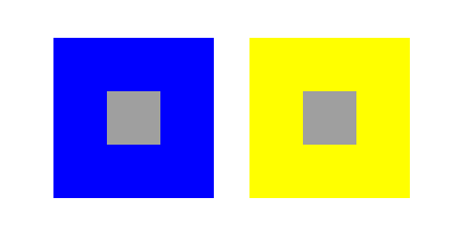
ある領域が別の色の領域で囲まれると、そこに囲んだ色の反対色が誘導される現象。灰色領域が青で囲まれると黄が誘導され(左図)、同じ灰色領域が黄で囲まれると青が誘導される(右図)。
「強化型色対比」
正方形の色は a = d と b = c のように見えるが、物理的な色は b = d である。
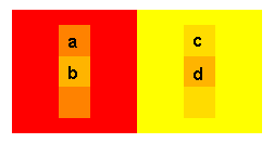
by Akiyoshi Kitaoka 2005 (May 27)
ただの色対比にあらず。上下の正方形を取ると、錯視量が減る(下図)。
Piersの論文1)に刺激されて作成。
1) Howe, P. D. L. (2005) White's effect: Removing the junctions but preserving the strength of the illusion. Perception, 34, 557 - 564.
もし先行研究で同じものがあるのを発見されましたら、ご一報下さい。直ちに修正します。 北岡にメールする
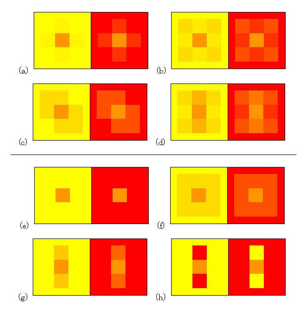
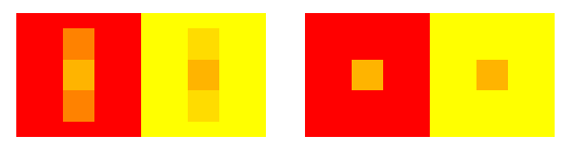
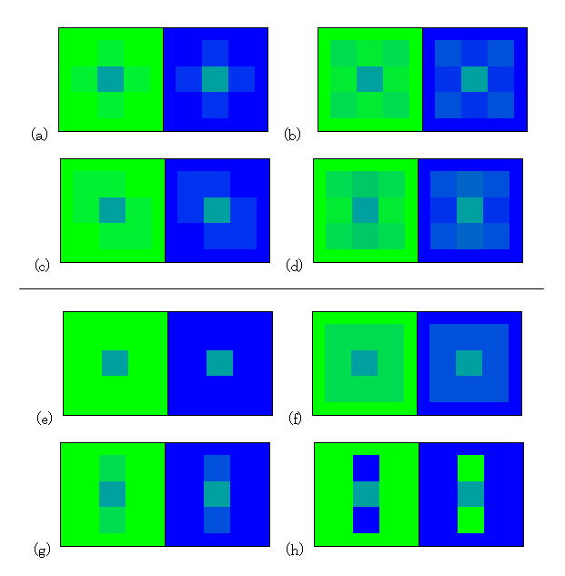
"Color contrast: Miscellaneous 2007 YR"
(a)-(g) The central square in the left half appears to be more reddish or less yellowish than that in the right one, though they are identical in color. (a)-(d) are the new demonstrations. (e) is the standard type. (f) is known (I guess). (g) is the enhanced color contrast I presented before. (h) is chromatic White's effect, where the central square in the left half might appear to be more yellowish or less reddish than that in the right one.
Copyright Akiyoshi Kitaoka 2007 (February 6)
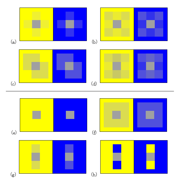
"Color contrast: Miscellaneous 2007 GB"
(a)-(g) The central square in the left half appears to be more bluish or less greenish than that in the right one, though they are identical in color. (a)-(d) are the new demonstrations. (e) is the standard type. (f) is known (I guess). (g) is the enhanced color contrast I presented before. (h) is chromatic White's effect, where the central square in the left half might appear to be more greenish or less bluish than that in the right one.
Copyright Akiyoshi Kitaoka 2007 (February 6)
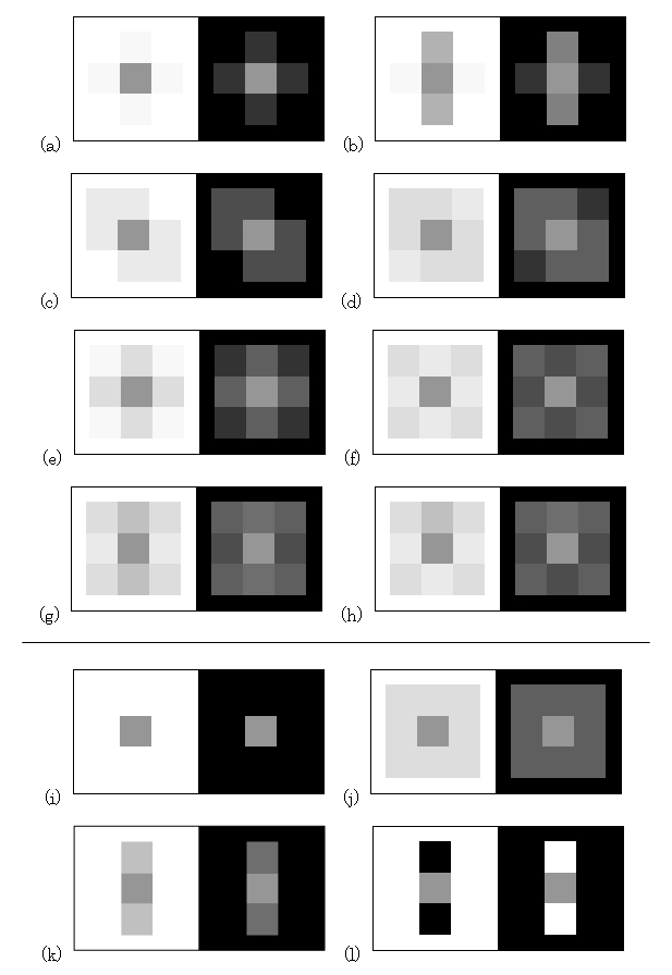
"Color contrast: Miscellaneous 2007 YB"
(a)-(g) The central gray square in the left half appears to be more bluish or less yellowish than that in the right one, though they are identical in color. (a)-(d) are the new demonstrations. (e) is the standard type. (f) is known (I guess). (g) is the enhanced color contrast I presented before. (h) is chromatic White's effect, where the central gray square in the left half might appear to be more yellowish or less bluish than that in the right one.
Copyright Akiyoshi Kitaoka 2007 (February 6)
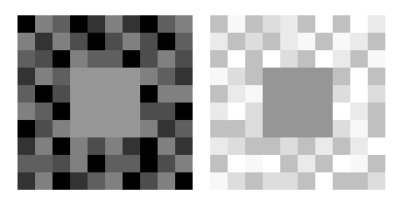
"Brightness contrast: Miscellaneous 2007"
(a)-(k) The central square in the left half appears to be darker than that in the right one, though they are identical in luminance. (a)-(h) are the new demonstrations. (i) is the standard type. (j) is known (I guess). (k) is the enhanced brightness contrast I presented before. (l) is White's effect, where the central square in the left half appears to be brighter or lighter than that in the right one.
Copyright Akiyoshi Kitaoka 2007 (February 5)
誘導部分が分節化(articulation)していると、明るさ対比の効果は大きい(Gilchrist and Annan, 2002)。
分節化は色の錯視には有効でないかもしれない
これでもダメな感じ。
栗木一郎先生のデモ 元のページ(東北大学) そのコピー(アクセスできない場合に使用)
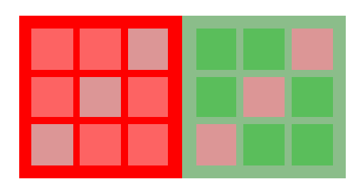
最初に作った作品「ドラゴン」・・・錯視量が少ない↓
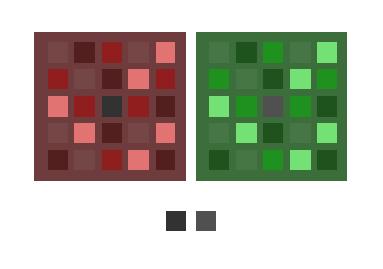
左の大きい正方形の中心の小さい正方形は緑色に見えるが、下の列の左の黒(r = 50, g = 50, b = 50)と同じである。一方、右の大きい正方形の中心の小さい正方形は紫色に見えるが、下の列の右の灰色(r = 80, g = 80, b = 80)と同じである。
Copyright Akiyoshi .Kitaoka 2005 (October 13)
「緑のタヌキ」と「ピンクの正方形」・・・色の恒常性の一種?色の対比の一種?
中央の灰色が緑に見える。こういう深い緑はモニターでは出せないはずだったのだが・・・
Copyright Akiyoshi Kitaoka 2005 (October 14)
中心の小さい正方形はピンクに見えるが、実際には灰色(のグラデーション)である。
Copyright Akiyoshi .Kitaoka 2005 (October 14)
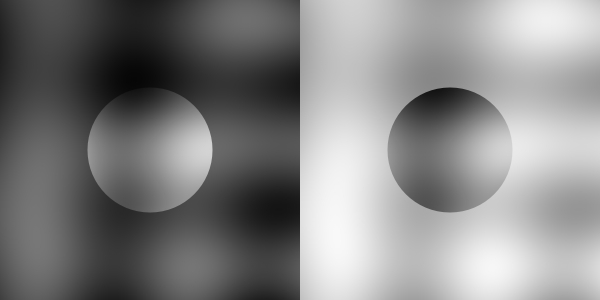
キルシュマンの法則(色の対比の法則) (Graham and Brown (1965) からの抄訳)
(1)誘導領域(取り囲む領域)と比較してテスト領域(ターゲット領域)が小さければ小さいほど、色の対比は大きい。
(2)色の対比は2つの領域が離れていても起こる。しかし、離れれば離れるほど対比の効果は減少する。
(3)色の対比の量は誘導領域の面積によって異なる。
(4)色の対比は、明るさの対比がないか少ないところで最大となる。 (第3法則と呼ばれる)
(5)明るさが同じならば、色の対比は誘導する色の飽和度(彩度)に影響される。
Graham, C. H. and Brown, J. L. (1965) Color contrast and color appearance:
Brightness constancy and color constancy. In C. H. Graham (Ed.), Vision
and visual perception, New York: John Wiley & Sons (pp 452-478). (In
this paper, the third and fourth laws are exchanged)
Kirschmann, A. (1891) Über die quantitativen Verhältnisse des stimultanen Helligkeits- und Farben-Contrastes. Phil. Stud., 6, 417-491.
Yund, E. W. and Armington, J. C. (1975) Color and brightness contrast effects as a function of spatial variables. Vision Research, 15, 917-929.
第3法則には否定的見解が出ている。
Kinney, J. A. S. (1962) Factors affecting induced colors. Vision Research, 2, 503-525.
Oyama, T. and Hsia, Y. (1966) Compensatory hue shift in simultaneous color contrast as a function of separation between inducing and test fields. Journal of Experimental Psychology, 71, 405-413.
しかし、
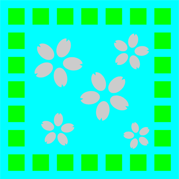
「入学式」
灰色で描いたサクラの花びらに、色が付いて見える。
Copyright Akiyoshi .Kitaoka 2007 (March 2)
図にカーソルを載せると、花びらは灰色であることがわかる。
遠隔色対比
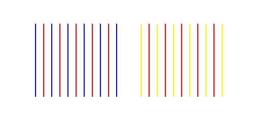
赤い線がある程度青い線より離れたところに置かれると、青の補色の黄色味がかって見える。黄色の線の間に置かれると黄の補色の青味がかって見える。
北岡明佳 (2001) 錯視のデザイン学(6)・色彩知覚の知られざる不安定性 日経サイエンス, 31(7), 128-129.
作品「色の分裂」・・・遠隔色対比の誘導図形は線でなくてもよい。↓
青色の正方形のまわりの赤はオレンジ色に見え、黄色の正方形のまわりの赤はマゼンタ色に見えるが、同じ赤である。
Copyright Akiyoshi .Kitaoka 2005 (May 27)
遠隔色同化
赤い線がある程度青い線より離れてはいるが近くに置かれると、青味がかって見える。黄色の線に近づくと、黄味がかって見える。
北岡明佳 (2001) 錯視のデザイン学(6)・色彩知覚の知られざる不安定性 日経サイエンス, 31(7), 128-129.
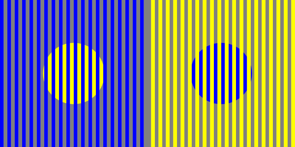
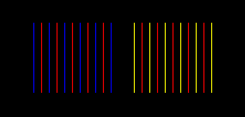
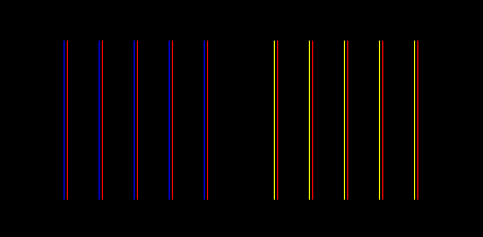
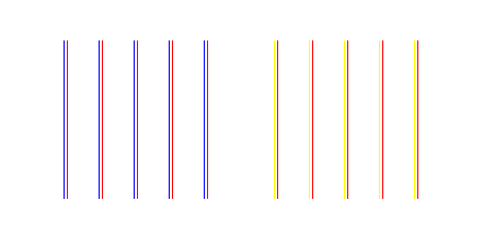
<色の同化>
(視覚の実験的研究でよく出てくるタイプ)
ある領域に、色の付いた細い線が乗ると、その色味が誘導されて見える現象。赤い領域に青線を乗せると赤紫に見え(左図)、同じ赤の領域に黄線を乗せるとオレンジ色に見える(右図)。
色の同化
(デザインの教科書等によく見かけるタイプ)

等間隔で細い縞模様を描くと、隣合った色相が誘導される。左の赤は青みがかって見え、右の赤は黄みがかかって見える。
ミカンのネットタイプの色の同化
Copyright Akiyoshi Kitaoka 2011 (May 5)
「ひまわりとダリア」
同じ赤が青味がかったり、オレンジ色に見える。
Copyright A.Kitaoka 2001
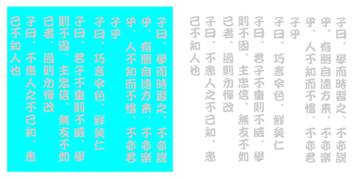
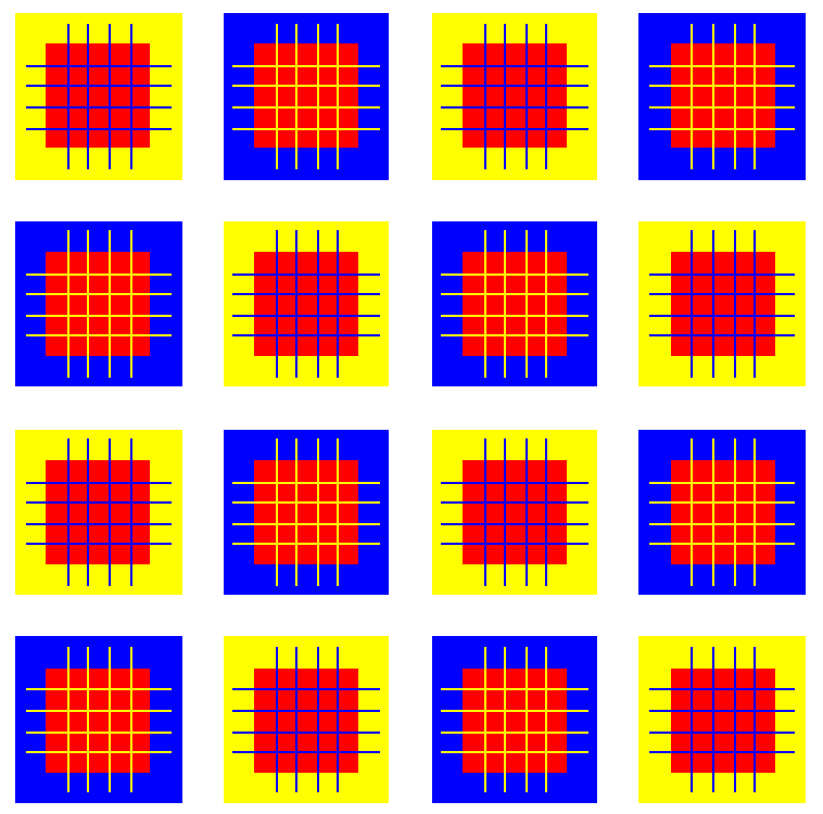
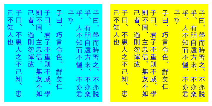
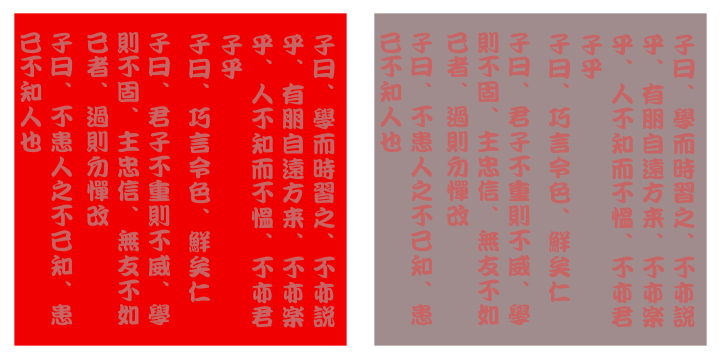
「論語式色の同化」
左右の赤の背景は同じ色であるが、右の方がややオレンジっぽく見える。
produced by Akiyoshi .Kitaoka 2008 (July 7)
テキストは「論語の世界」より借用
「論語式明るさの同化」
左右の灰色の背景は同じ明るさであるが、右の方がやや明るく見える。(暗く見えるような気もするなあ)
Copyright Akiyoshi Kitaoka 2008 (July 7)
<色の逆同化>
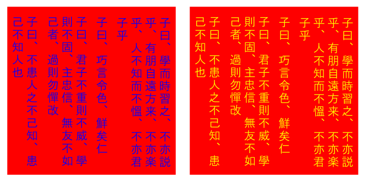
「論語式色の逆同化」
左右の文字は同じ色であるが、左は水色、右は黄緑色に見える。
Copyright Akiyoshi Kitaoka 2008 (July 7)
「論語式色の逆同化 3」
左右の文字は同じ青であるが、右は彩度が低く見える。
Copyright Akiyoshi Kitaoka 2008 (July 7)
More info
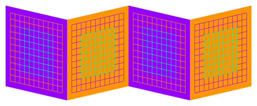
「4枚カード問題」
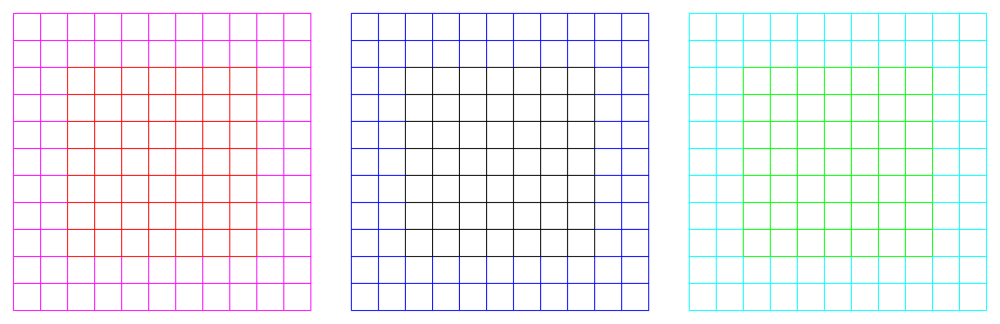
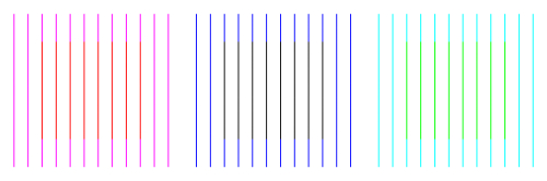
カードの内側のグリッドが水色と黄緑に見えるが、同じ色である。
Copyright Akiyoshi Kitaoka 2008 (July 7)
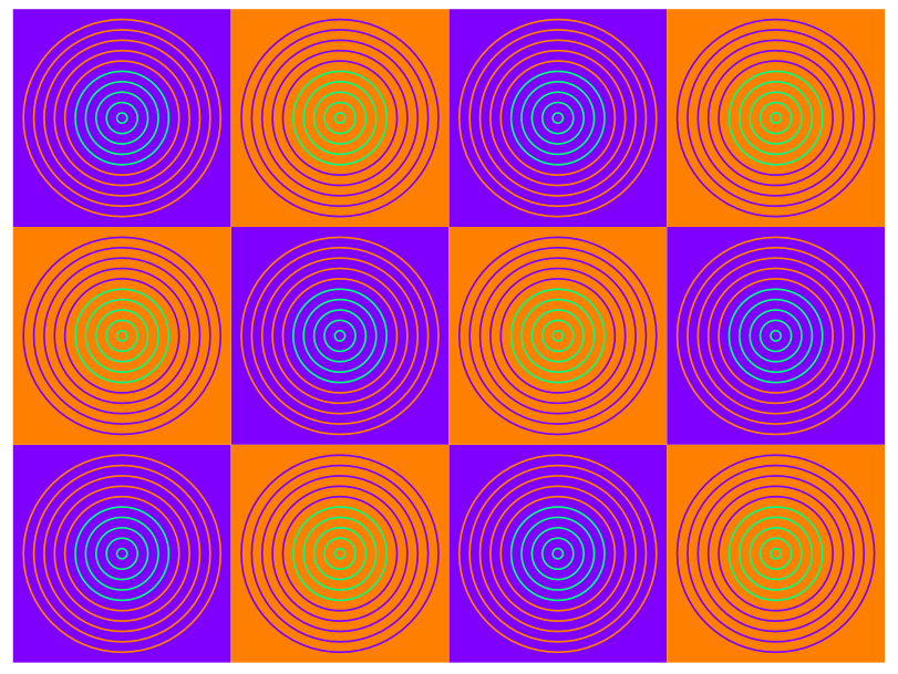
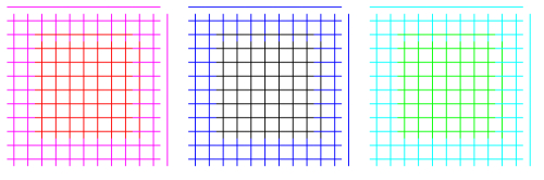
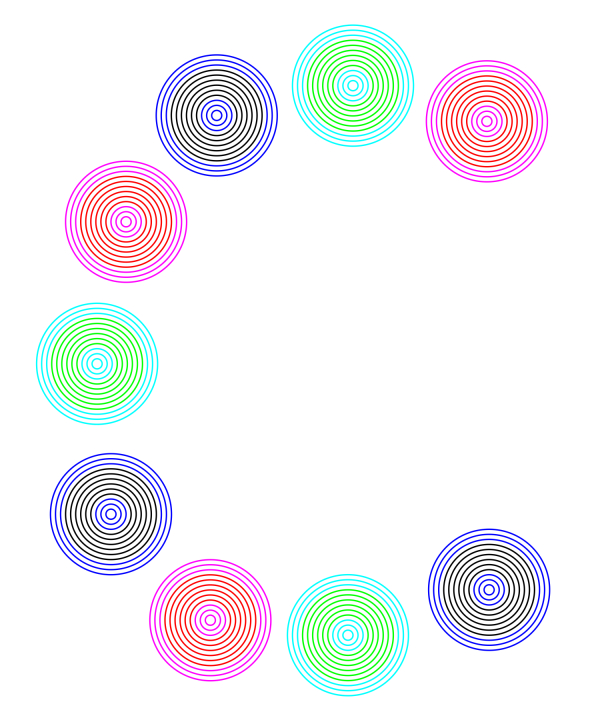
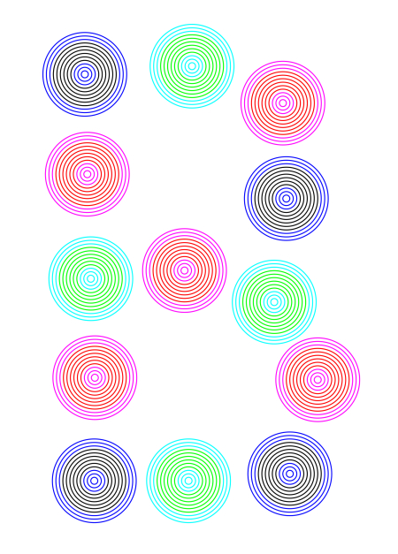
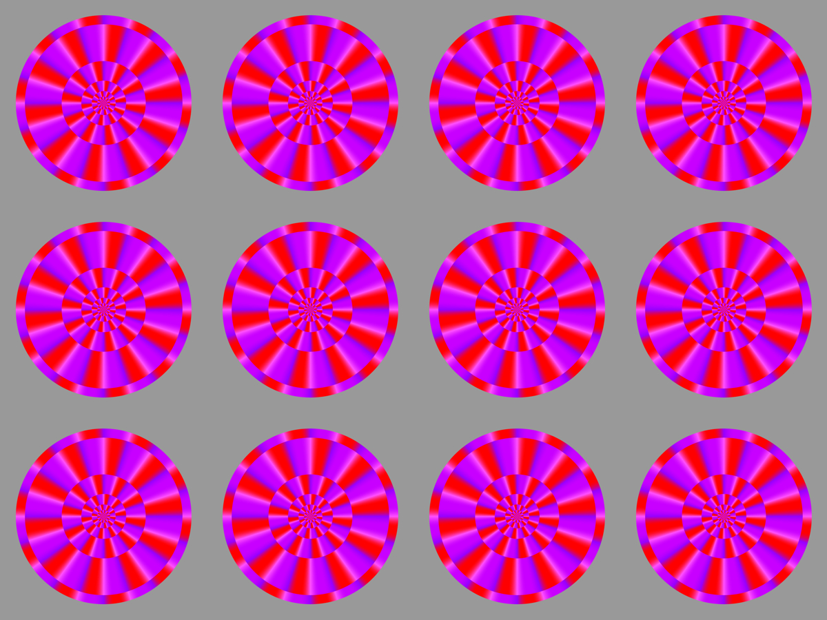
「ぐるぐる 3」
それぞれの同心円の内側の4つのリングは同じ色であるが、違う色に囲まれると異なって見える。画面から離れてみた方が効果が大きい。
Copyright Akiyoshi .Kitaoka 2007 (January 15)
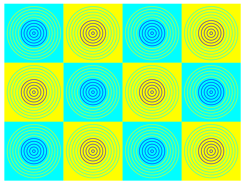
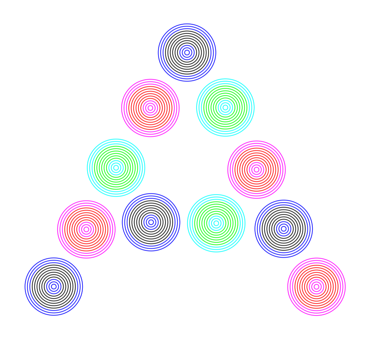
「ぐるぐる 6」
それぞれの同心円の内側の4つのリングは同じ色であるが、違う色に囲まれると異なって見える。画面から離れてみた方が効果が大きい。
Copyright Akiyoshi .Kitaoka 2007 (January 15)

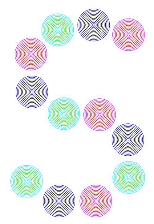
「ぐるぐる 7」
それぞれの同心円の内側の4つのリングは同じ色であるが、違う色に囲まれると異なって見える。画面から離れてみた方が効果が大きい。
Copyright Akiyoshi .Kitaoka 2007 (January 15)
「ぐるぐる」という絵本がある。
鈴木亜弥(絵)・安井智草(文) 「ぐるぐる」 新風舎 ISBN4-7974-5595-0 (定価1000円
+ 税)
「顔色がよくなる錯視」
顔色がよくなった。
Copyright Akiyoshi .Kitaoka 2007 (March 10)
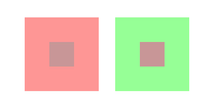
<彩度の対比と同化?>
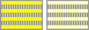
彩度(色の鮮やかさ)の高い色に囲まれた領域の彩度は低く見え(左図)、彩度の低い色の囲まれた領域の彩度は高く見える(右図)。

「絆創膏」
絆創膏(バンドエイドあるいはカットバン)の真ん中の正方形は左右とも同じ色であるが、左の方が鮮やかに見える。
Copyright Akiyoshi .Kitaoka 2007 (January 6)
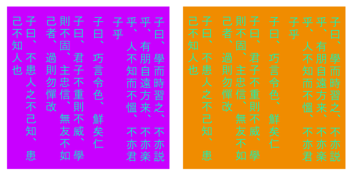
「論語式彩度対比」
左右の文字は同じ色であるが、右の方があざやかに見える。
Copyright Akiyoshi Kitaoka 2008 (July 7)
酒井の色対比・・・彩度対比の一種?色の対比の一種?色の恒常性の一種?
中の正方形の色は同じであるが、左のは灰色に見える。
中の正方形の色は同じであるが、右のは灰色に見える。
左上5列の「灰色」と右下5列の「赤」は物理的には同じであり、右上5列の「灰色」と左下5列の「緑」は物理的には同じである。
左上5列の「灰色」と右下5列の「青」は物理的には同じであり、右上5列の「灰色」と左下5列の「黄」は物理的には同じである。
酒井香澄(「Landの二色法による色再現とBelseyの仮説検証」立命館大学文学部哲学科心理学専攻2002年度卒業論文)の発見をベースにしている。
「あじさい」
斜めに並んだ3個同士は同じ色であるが、右の方が赤味が多く見える。
Copyright A.Kitaoka 2005 (May 26)
「みやびなカメ」
カメには赤、緑、灰色の3種類がいるように見えるが、物理的な色で言えば2種類しかいない。
Copyright Akiyoshi .Kitaoka 2007 (January 6)
cf. Snake illusion: Adelson, E. H. (2000) Lightness perception and lightness illusions. In M. Gazzaniga (Ed.), The New Cognitive Neurosciences, 2nd ed. Cambridge, MA: MIT Press. (pp. 339-351).
Copyright Akiyoshi Kitaoka 2011 (May 5)
「松田の彩度同化」
縦の細い格子は左右同じ色であるが、左の方がより鮮やかに見える。松田博子先生による。
Copyright Akiyoshi Kitaoka 2011 (May 2)
松田先生によると「トーン同化」と言えるかもしれないとのことである。
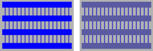
Copyright Akiyoshi Kitaoka 2011 (May 9)
<色の補完>
ネオン色拡散
色の十字の周りがパッチ状に同色に色づいて見える。
Varin, D. (1971) Fenomeni di contrasto e diffusione cromatica nell'organizzazione spaziale del campo percettivo. Rivista di Psicologia, 65, 101-128.
Van Tuijl, H. F. J. M. (1975). A new visual illusion: Neonlike color spreading and complementary color induction between subjective contours. Acta Psychologica, 39, 441-445.
Redies, C. and Spillmann, L. (1981). The neon color effect in the Ehrenstein illusion. Perception, 10, 667-681.
「ネオン色拡散による針差し格子錯視」1)
一様な白い背景上を縦横に水色の線が走って見える。「クモの巣の糸」(Spinnwebfäden)2)あるいは「色の筋」(colored street)3)と呼ばれたものと同じと考えられる。
Copyright Akiyoshi Kitaoka 2001
1) 北岡明佳 (2001) 錯視のデザイン学(7):工学的にはとらえきれない幻の光知覚 日経サイエンス, 31(8), 66-68.
2) Prandtl, A. (1927). Über gleichsinnege Induktion und die Lichtverteilung in gitterartigen Mustern. Zeitschrift für Sinnesphysiologie, 58, 263-307.
3) Redies, C., Spillmann, L. and Kunz, K. (1984). Colored neon flanks and line gap enhancement. Vision Research, 24, 1301-1309.
「色光線錯視」1)
一様な白い背景上を赤色の線が斜めに走って見える。
Copyright Akiyoshi Kitaoka 2001
1) 北岡明佳 (2001) 錯視のデザイン学(7):工学的にはとらえきれない幻の光知覚 日経サイエンス, 31(8), 66-68.
「色光線錯視2」1)
一様な白い背景上を黄色の線が斜めに走って見える。
Copyright Akiyoshi Kitaoka 2001
1) 北岡明佳 (2001) 錯視のデザイン学(7):工学的にはとらえきれない幻の光知覚 日経サイエンス, 31(8), 66-68.
「色光線錯視3」1)
一様な白い背景上を緑色の線が斜めに走って見える。
Copyright Akiyoshi Kitaoka 2001
1) 北岡明佳 (2001) 錯視のデザイン学(7):工学的にはとらえきれない幻の光知覚 日経サイエンス, 31(8), 66-68.
水彩錯視
水彩効果(watercolor effect)あるいは水彩錯視(watercolor illusion):
Pinna, B., Brelstaff, G., and Spillmann, L. (2001) Surface color from boundaries: a new ‘watercolor’ illusion. Vision Research, 41, 2669-2676.
下図は水彩錯視いろいろ
宗宮の波線色錯視
"Wave-line color illusion" (Sohmiya's
illusion)
(Sohmiya, S. (2007) A wave-line colour illusion.
Perception, 36, 1396-1398)
The white background behind the orange waves appears to be tinted orange.
produced by Akiyoshi Kitaoka 2009 (February 19)
「黄ばみ錯視」
格子の中央部分が黄ばんで見える。しかし、これらの図には黄色は使っていないし、輝度条件から考えるとネオン色拡散が起こる位置が逆である。
Copyright Akiyoshi Kitaoka 2007 (September 18)
cf.
Van Tuijl, H. F. J. M. (1975). A new visual illusion: Neonlike color spreading and complementary color induction between subjective contours. Acta Psychologica, 39, 441-445.
Sohmiya, S. (2005) Explanation for neon color effect in achromatic line segments on chromatic inducers based on the multiple interprertation hypothesis. Perceptual and Motor Skills, 101, 267-282.
以下、類似図形。
「黄ばみ研究C」
同心円の内部がドーナツ状に黄ばんで見える。
Copyright Akiyoshi Kitaoka 2007 (September 27)
「黄ばみ研究B」
同心円の内部がドーナツ状に黄ばんで見える。
Copyright Akiyoshi Kitaoka 2007 (September 27)
「黄ばみ研究A」
同心円の内部がドーナツ状に基盤ではなくて黄ばんで見える。
Copyright Akiyoshi Kitaoka 2007 (September 27)
「黄ばみ研究S」
同心円の内部がドーナツ状に黄ばんで見える。
Copyright Akiyoshi Kitaoka 2007 (September 27)
色立体視
Chromostereopsis
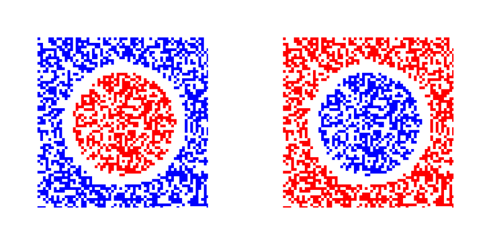
赤が青より手前に見える人が過半数を占めるが、青が赤よりも手前に見える人も20%程度いる。
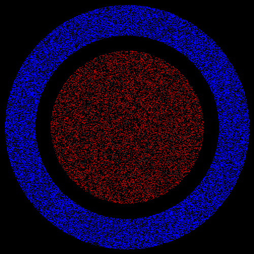
「青い穴」
青い穴が開いているように見える。離れて見ると効果的。孔の周囲のドットが赤紫に見えるが、その外側の赤と同じ色である。
Copyright Akitaoka Kitaoka 2007 (March 9)
「カマボコ」
赤い部分がカマボコ形の頂点に見える、という見え方をする人が多いと推定される。
Copyright A.Kitaoka 2003
Chromostereopsis. For the majority of observers, the inset made up of red random dots appears to be in front of the surround constituted of blue ones. For a minority, the inset appears to be behind the surround. The rest do not experience the phenomenon. Chromostereopsis is strong when observers see the image at a distance.
Copyright Akiyoshi Kitaoka 2013 (August 3)
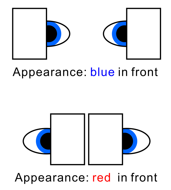
Background luminance-dependent reversal; color reversal
Copyright Akiyoshi Kitaoka 2013 (August 3)
Longitudinal chromatic aberration
Copyright Akiyoshi Kitaoka 2005 (November 24)
![]()
Transverse chromatic aberration
Copyright Akiyoshi Kitaoka 2005 (November 24)
Einthoven's (1885) covering method
Copyright Akiyoshi Kitaoka 2009 (February 29)
![]()
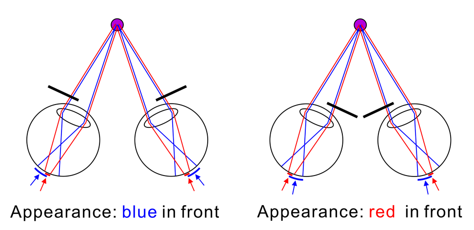
Artificial pupil method & Stiles-Crawford effect
---> Vos' (1960, 2008) "generalised Bruecke-Einthoven explanation"
Copyright Akiyoshi Kitaoka 2009 (February 29)
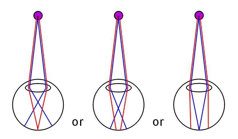
Center-of-gravity model (Kitaoka et al., 2005)
Copyright Akiyoshi Kitaoka 2013 (July 25)
Kitaoka, A, Kuriki, I. and Ashida, H. (2006). The center-of-gravity model of chromostereopsis. Ritsumeikan Journal of Human Sciences, 11, 59-64. PDF
Kitaoka's explanation of the background luminance-dependent reversal
Copyright Akiyoshi Kitaoka 2013 (July 25)
その他、色収差による色ずれの作品「額がガクガク」↓
青い線の正方形が赤と緑の境界のところでずれているように見える。作者にはそう見えるが、理論的にはそう見えない人もいると思われる。そのほか、ヘルマン格子錯視や色の同化が見られる。
Copyright A.Kitaoka 2003 (June 16, 2003)
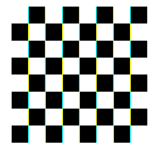
「色収差錯視チェッカーボード」
近眼で眼鏡をかけている人は、顔を右に向けて目は左でこの図を見ると、上半分のそれぞれの正方形の左側は鮮やかな水色、右側は黄色(あるいはオレンジ色)に見える。この時、下半分の正方形の両側は緑色に見える。顔を左に向けた場合はその反対。遠視あるいは老視の眼鏡をかけている人は多分逆。
Copyright Akiyoshi .Kitaoka 2005 (October 9)
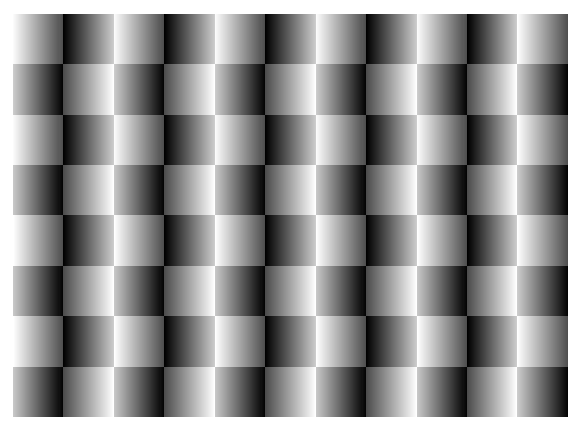
「色変化ふにゃふにゃカーペット」
近眼で眼鏡をかけている人は、顔を右に向けて目は左でこの図を見ると、左から2、4、6、8、10列目が黄味を帯びて見え、残りが青味を帯びて見える。顔を左に向けた場合はその反対。遠視あるいは老視の眼鏡をかけている人は多分逆。そのほか、図がふにゃふにゃと不安定に見える錯視がある。
Copyright Akiyoshi .Kitaoka 2005 (October 9)
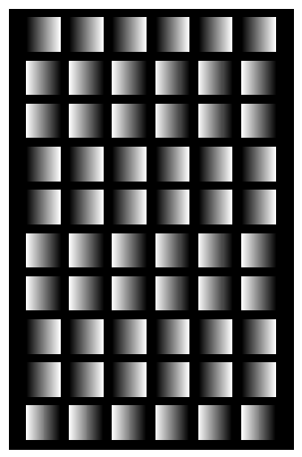
「金箔と銀箔」
近眼で眼鏡をかけている人は、顔を右に向けて目は左でこの図を見ると、上から1、4、5、8、9列目が金色に、残りが銀色に見える。顔を左に向けた場合はその反対。遠視あるいは老視の眼鏡をかけている人は多分逆。そのほか、列が動いて見える錯視と、正方形なのに明るい側が大きく見える錯視がある。
Copyright Akiyoshi .Kitaoka 2005 (October 9)
<動くと色が変わって見える錯視>
「明るさ変調リング」
中央を見ながら図に目を近づけると、上と下の扇は連動して明るく、やや黄色っぽく見え、右と左の扇は連動して暗く、やや青みがかって見える。図から遠ざかる時は、その逆に、上と下の扇は連動して暗く、やや青みがかって見え、右と左の扇は連動して明るく、やや黄色っぽく見える。
Copyright Akiyoshi Kitaoka 2012 (November 19)
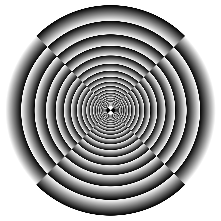
「二つの環」
内側のリングは縮小して見え、外側のリングは拡大して見える(最適化型フレーザー・ウィルコックス錯視)。中心を見ながら図に目を近づけたり遠ざけたりすると、リングがお互いに反対方向に回転して見える(回転オオウチ錯視)。また、中心を見ながら図に目を近づけると内側のリングが赤味を増し、目を遠ざけると外側のリングが赤味を増す。1つの図で3つも錯視が楽しめるおトクな錯視デザイン。
Copyright A.Kitaoka 2005 (April 1)
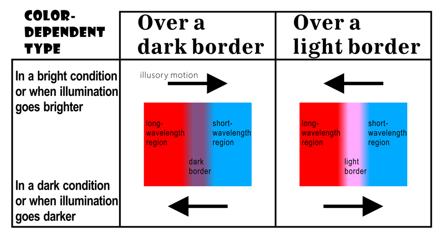
色が変わる錯視を説明する仮説・・・処理速度説↓
刺激イメージが網膜上で動いた場合、長波長の刺激の視覚処理が早く、短波長の刺激の視覚処理が遅いと考えると説明できる。図では矢印の先の赤が増加して見え、後方に残る青は黄色と打ち消しあって無彩色に近くなる。
北岡明佳著 錯視入門 朝倉書店 (2010年7月) ![]() new!
new!
"Rotating red-and-purple disks"
Each disk appears to rotate clockwise on a bright display, while it appears to rotate counterclockwise with a printed image under dark illumination.
Copyright Akiyoshi Kitaoka 2013 (February 6)
Conclusion in advance
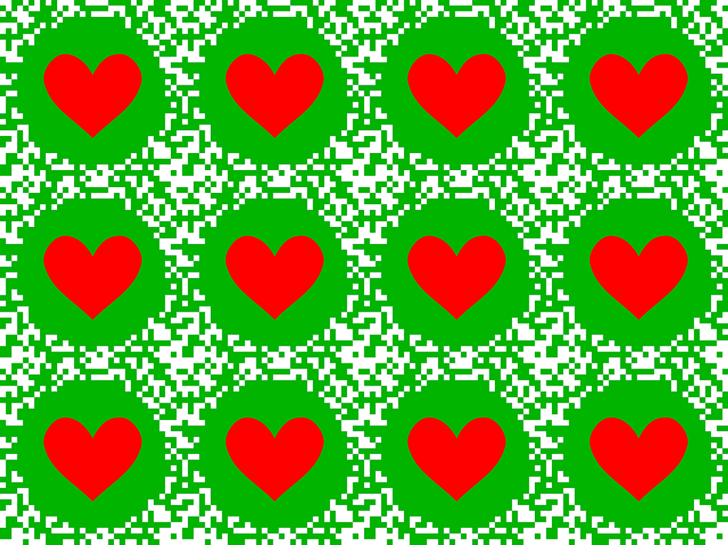
"Fluttering red hearts in front of the green background"
Hearts appear to move when the image is moved or your pair of glasses are moved. This illusion is enhanced in a dark condition or in the mesopic vision.
Copyright Akiyoshi Kitaoka 2013 (January 21)
 おしまい
おしまい

